in 2020, I was approached by the CEO of a local Denver startup, Gritly, for my first UX project. Gritly helps increase diversity in the workplace by providing resources and education to those who are trying to break into the industry. Launched in one month's time, I was the key contributor to every step of the design process. I collaborated with a small team to create the debut interactive dashboard for a company called Gritly. From brainstorming, drafting, research, user journeys, mockups, and wireframing, to implementation and finally, release and updates. Gritly has gone on to receive many awards.
View the presentation and scroll down for more design processes.
Problem:
With the company growing, multiple stakeholders, and high demand, the user portal and friendliness were failing. How would we best serve them, while providing the greatest ROI? By utilizing and creating user portals that served to provide the best user accessibility and experience for those who chose our product.
Approach:
Tools: Figma, Illustrator, Photoshop, G Suite, Slack
Process: Question <-> Extract Ideology <-> Start with a base persona <-> Build up on its attributes <-> Eventually arrive at a finalized perfect fit persona type <-> Figure out/predict some close-ended replies <-> Data analytics and metrics on the collected answers data <-> Feed into a supervised model made with answers as weights to the hidden layers.
Research & Drafting:
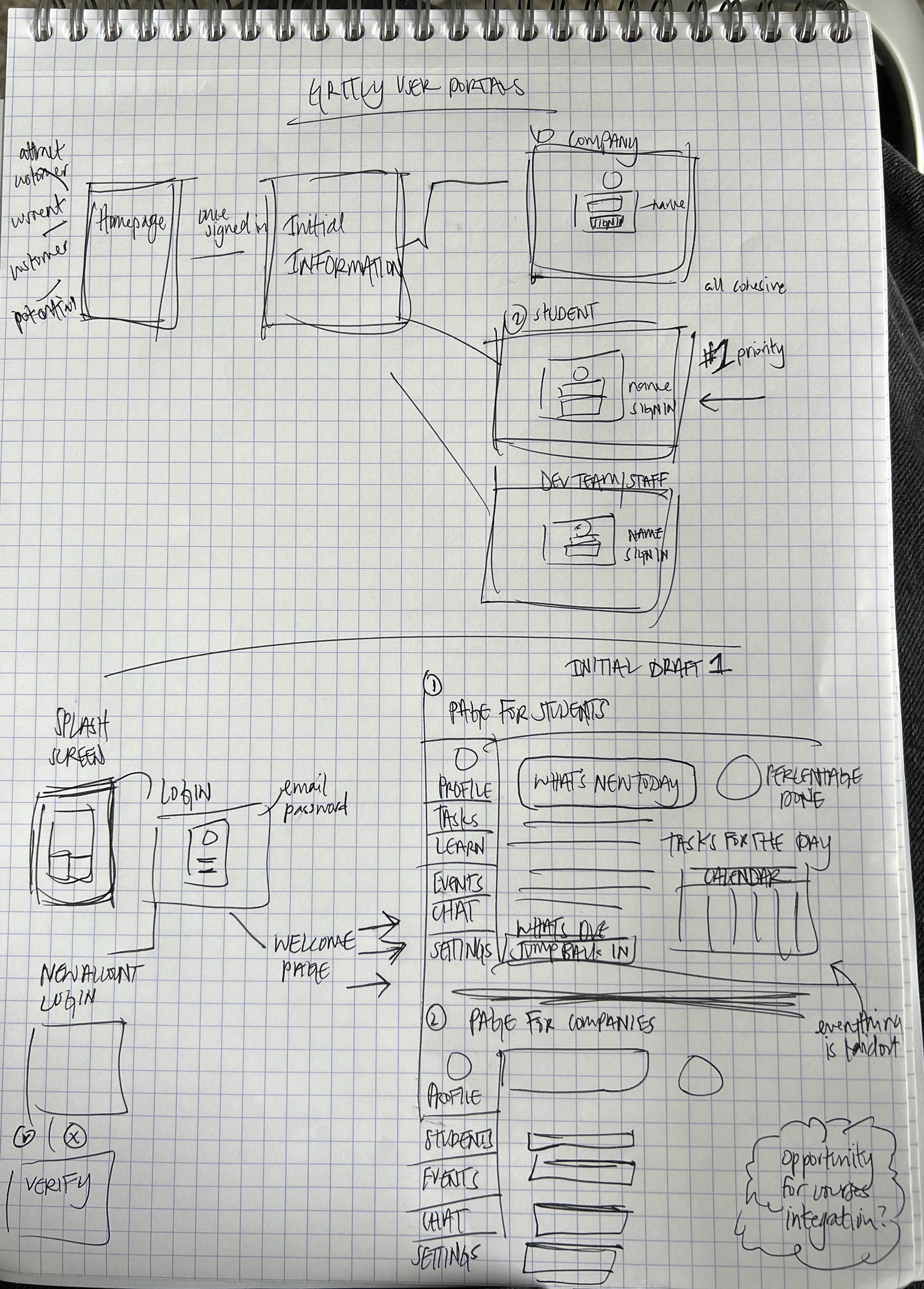
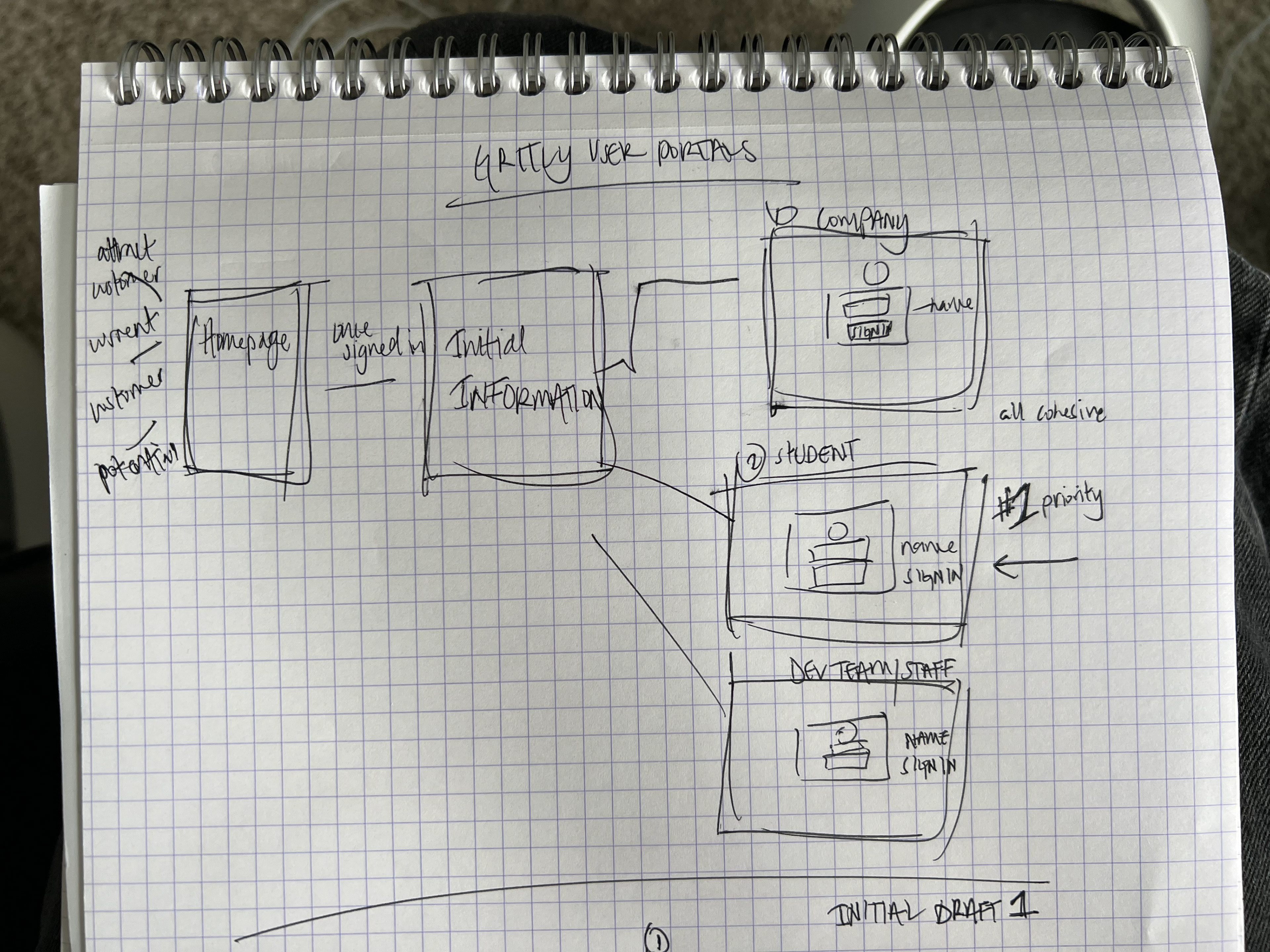
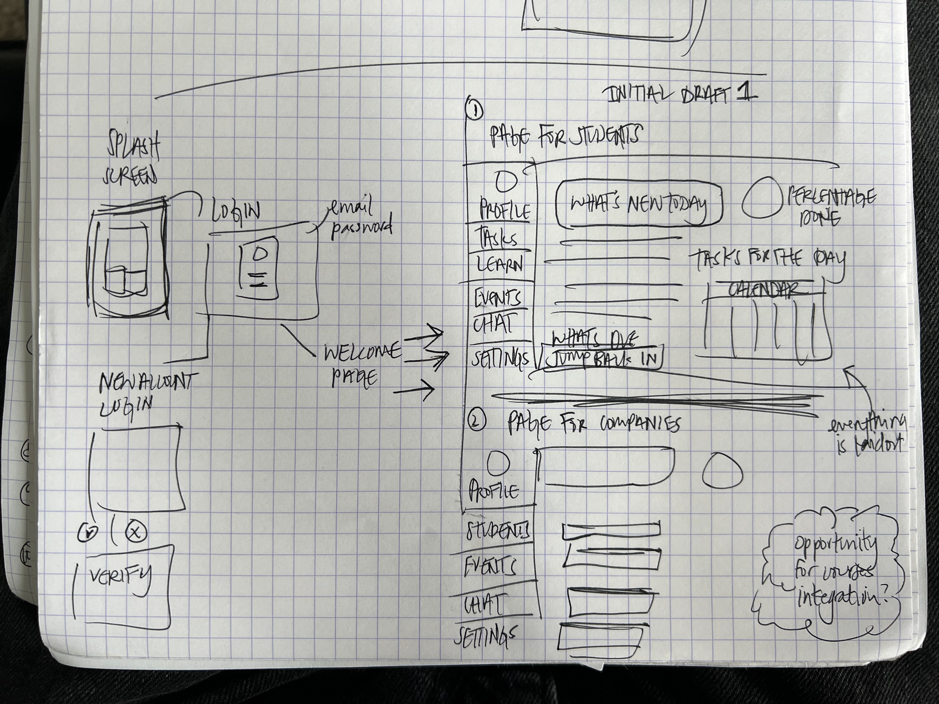
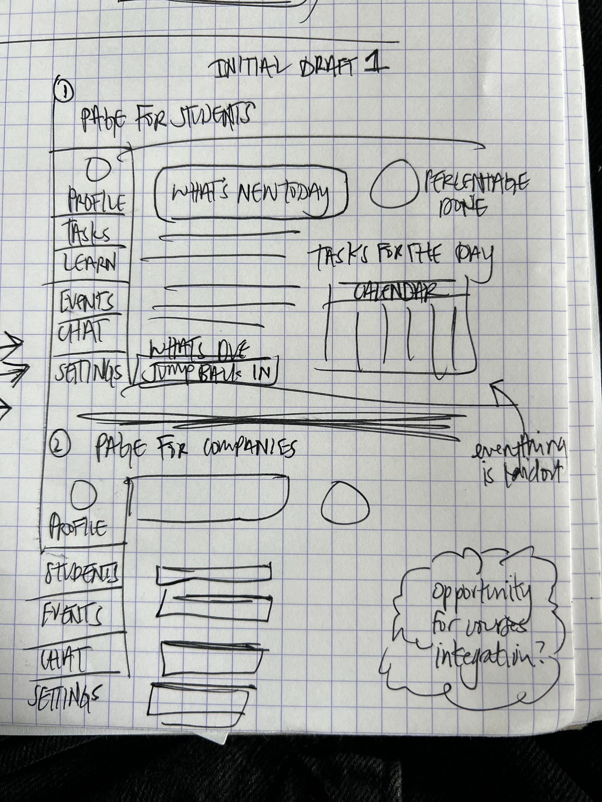
In the first stage, we researched different user portals (such as Canva, Blackboard, etc.) and gathered notes on their accessibility, function, design, and log-in portals. We then created and drafted different wireframes (see below) in Figma. With multiple base drafts, we conducted real-time user interviews.
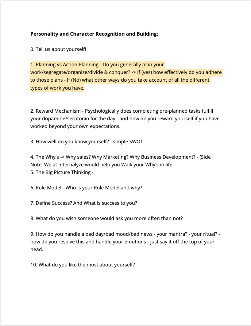
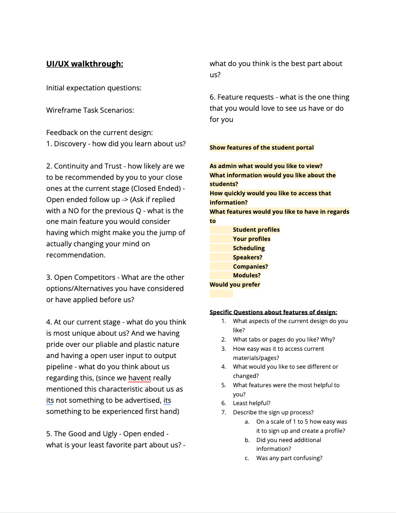
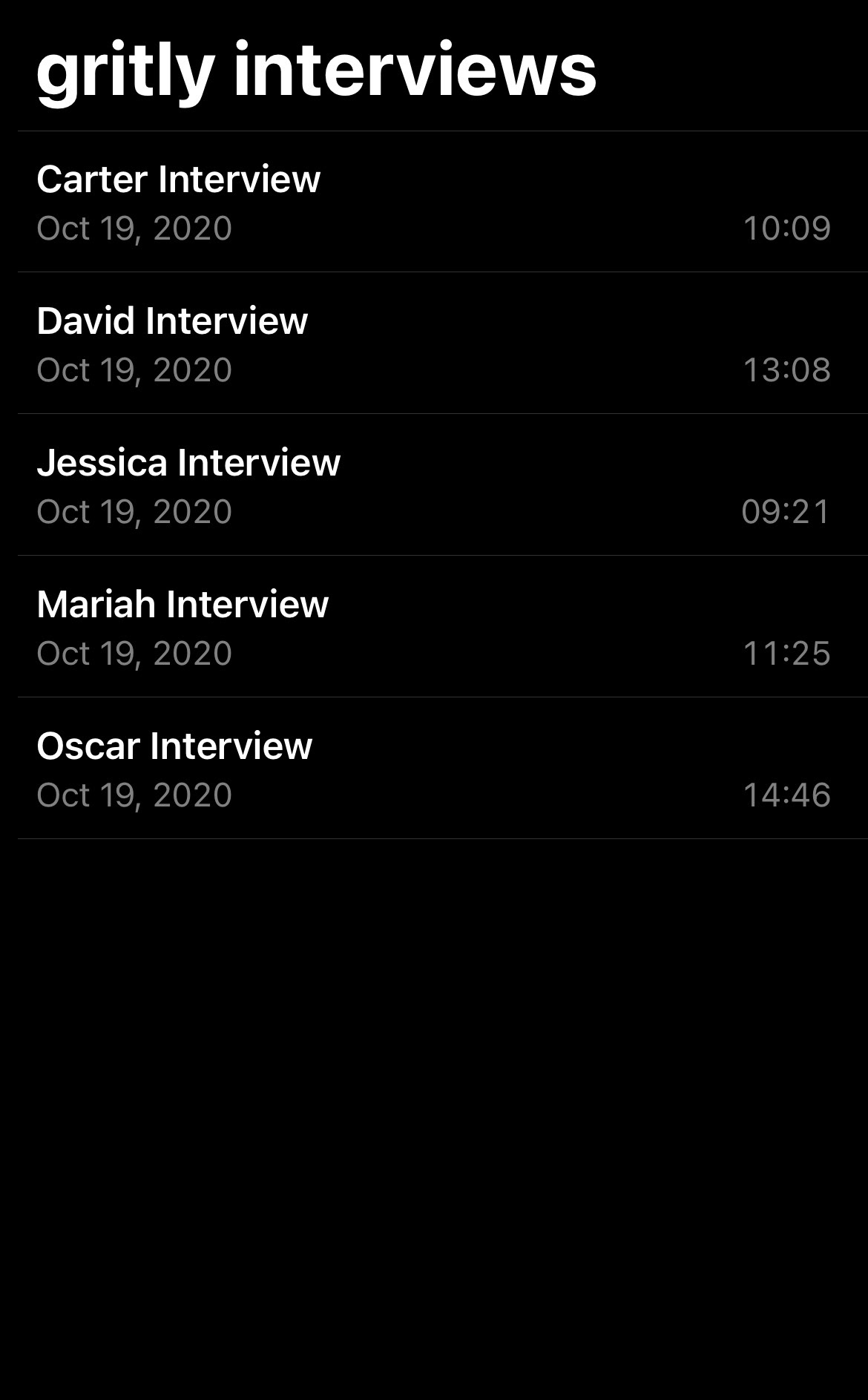
Since our approach was to create user personas that we could model a portal for, we dedicated quite a bit of time to interviewing different Gritly members. To the right, you'll how we conducted the interviews and the questions we asked.
After conducting the research, we built user personas (what are the pain points, what features would be the best for our users, and how they function) we then repeated the process.
Wireframes: I don't have access to the original files in Fimga anymore! But here are the original drafts:
Results:
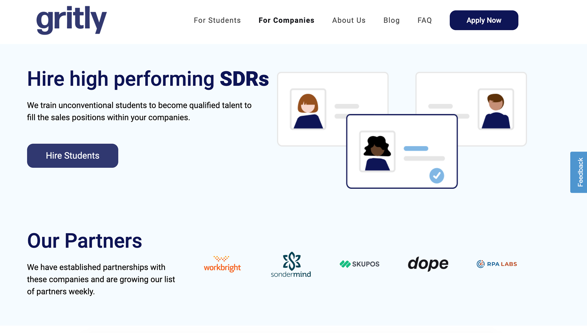
Check out the site for yourself. 3 user portals! One for the students, one for the companies, and one for us as developers behind the scenes.
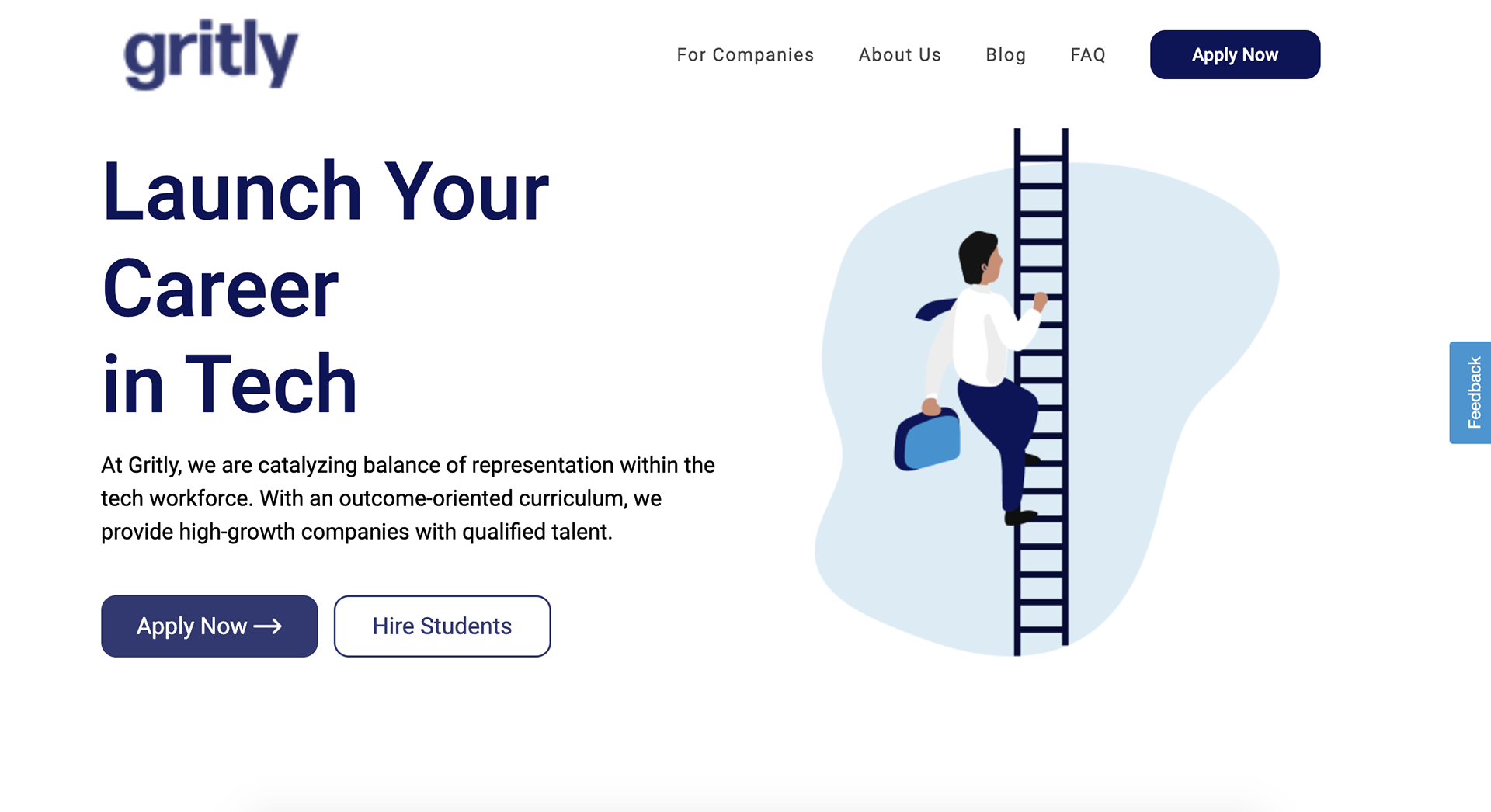
Here are the user pages before you log in:
Key Takeaways: What would have done differently:
1. Interview different people outside of Gritly. I feel like that would have been key to making something even more competitive.
2. Prioritize quick drafting and quick turnaround times. I had multiple projects that were all demanding my attention. Going back I would make sure I am drafting more quickly, even if it was just sketches and doing it at a much quicker pace to get more targeted feedback.
3. Ask better questions. This was my first UI/UX project and I know I could have asked better questions. Such as "What do we want to see in the first build?", "What can we expect in our first/second / etc. build", "When is our estimated/anticipated / desired deadline?", "Are there any limits? (time, money, team capacity/knowledge)", and many others.
4. Take screenshots of the wireframing and drafting in Figma! Unfortunately, my BIGGEST regret is not being able to show off all the behind scenes work due to IP.