Trimble Modus
Building the first mobile design system for a company of 120+ designers across 3 platforms
Overview
Trimble needed a unified mobile design system to serve 120+ designers working across iOS, Android, and web platforms. The existing desktop system (Modus) had grown organically but lacked mobile-specific patterns, leading to inconsistent experiences across products.
I was brought on to design and deliver the first mobile extension of the Modus design system, completing what was projected as a 2-year effort in just 4 months.
The Big Numbers
The mobile design system shipped ahead of schedule and was adopted across multiple product teams within weeks of launch.
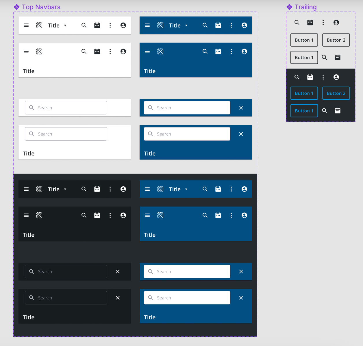
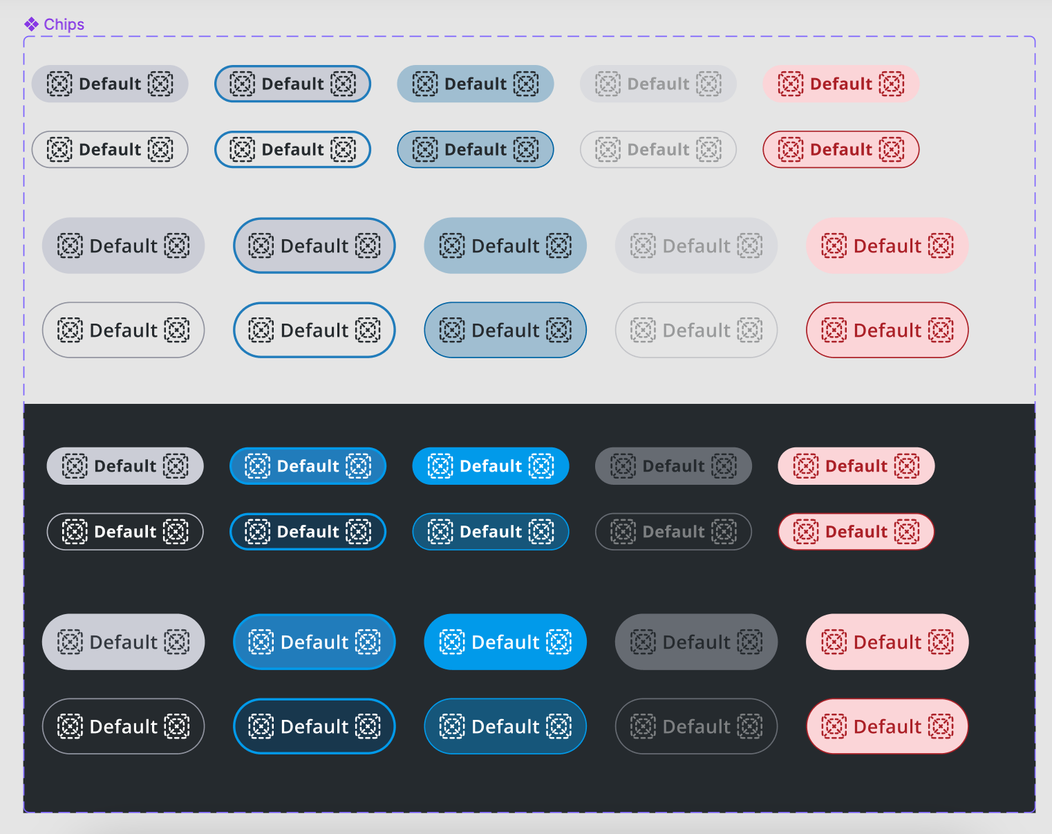
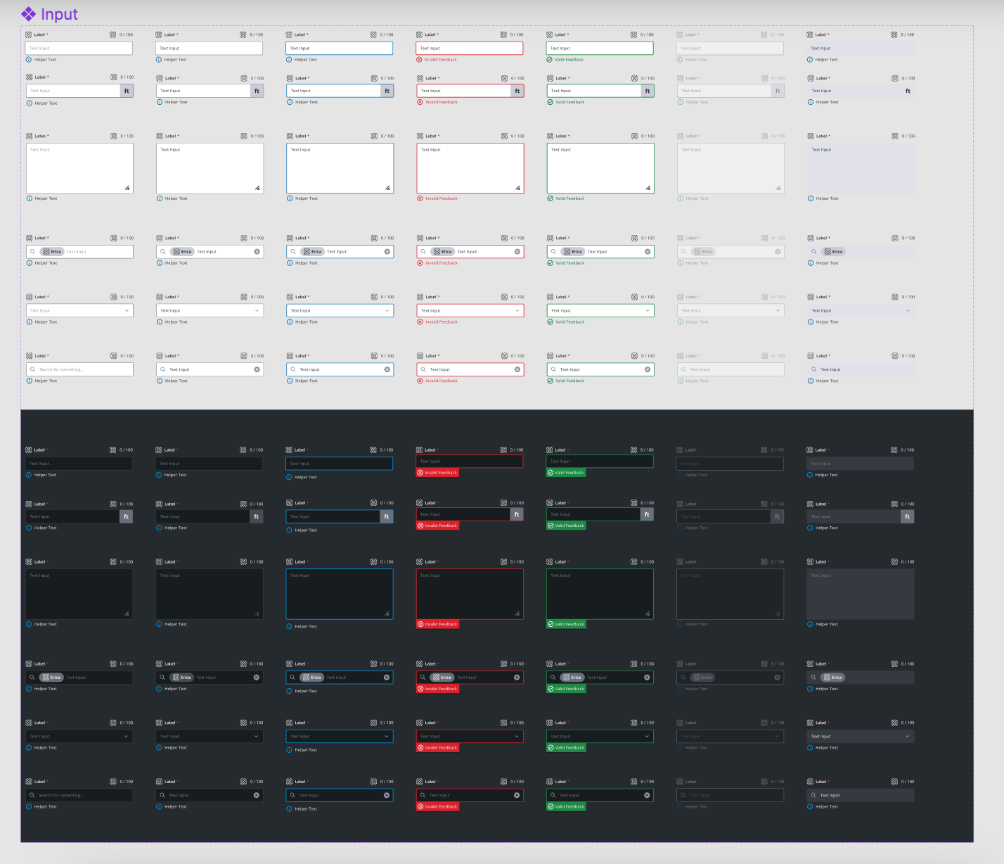
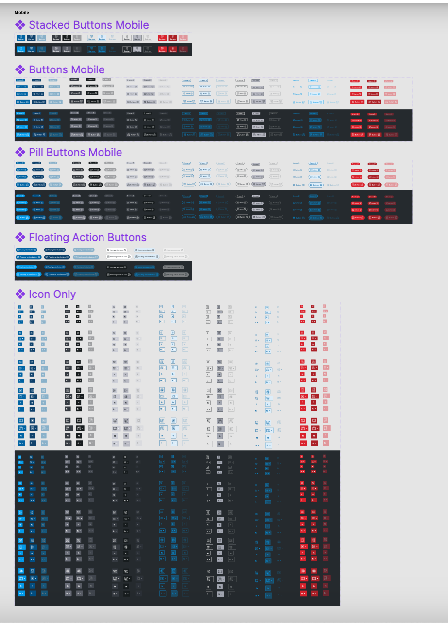
What I Worked On
Designed and documented 95+ mobile components with full variant support, interaction states, and accessibility annotations. Created platform-specific guidelines for iOS and Android while maintaining visual consistency with the existing desktop system.
- Component design with full state coverage (default, hover, focus, disabled, error)
- Platform-specific patterns for iOS and Android conventions
- Design token architecture extending the existing Modus token system
- Documentation and usage guidelines for each component
- Accessibility annotations meeting WCAG 2.1 AA
The Challenge
The existing Modus desktop system had been built over years by multiple teams. Extending it to mobile meant reconciling different platform conventions (iOS Human Interface Guidelines vs Material Design) while keeping a single source of truth.
With 120+ designers across the organization, adoption required not just good components but clear migration paths, documentation, and governance.
The Solution
I built the mobile system as a natural extension rather than a separate product. Shared tokens ensured color, typography, and spacing stayed consistent while platform-specific patterns respected native conventions.
The component library was organized around use cases rather than atomic categories, making it intuitive for designers to find what they needed without deep system knowledge.
Design System Architecture
The mobile design system was built on a token-first architecture. Every visual decision - color, spacing, typography, elevation - was defined as a token that could be themed per platform while maintaining consistency.
Micro-Animations & Interaction Design
Systematic animation patterns for Trimble's design system, ensuring consistent interaction feedback across products.
Border Spinner
Loading indicator at multiple sizes
Signals ongoing activity in constrained spaces
Grow Indicator
Pulsing dot loader
Subtle loading signal for inline or compact contexts
Progress Bar
Determinate progress at two heights
Tracks completion for uploads, installs, or processes
Switch Toggle
On/off toggle with spring easing
Provides tactile feedback for binary settings
Skeleton Loading
Shimmer placeholder card
Maintains layout stability while content loads
Checkbox Animation
Animated check with stroke draw
Confirms selection with satisfying micro-feedback
Accordion Expand
Collapsible content sections
Manages information density with smooth reveal
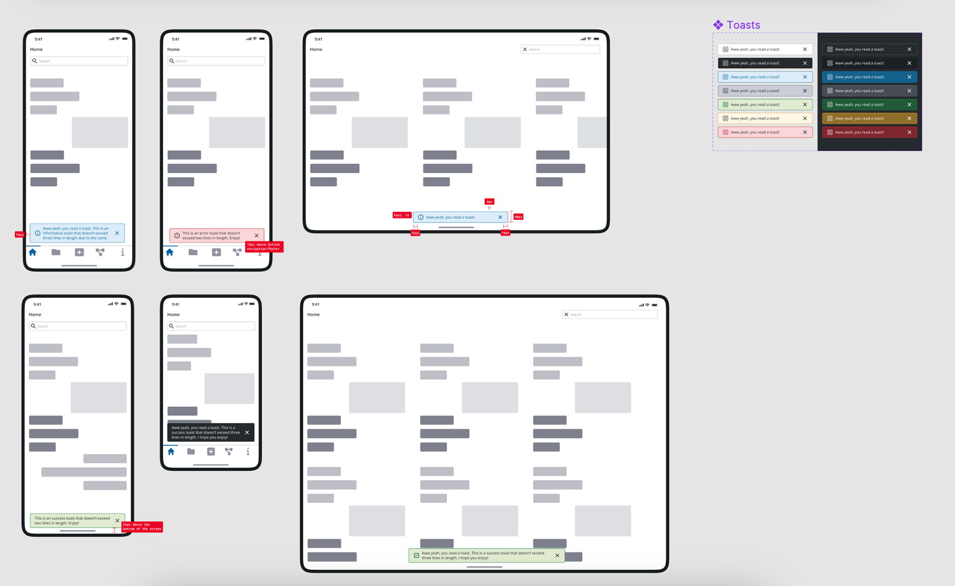
Toast Notification
Slide-in success message
Non-blocking feedback for completed actions
What I'm Proud Of
- Delivered a 2-year projected effort in 4 months without cutting corners on quality
- Created a system adopted by 120+ designers across 3 platforms
- Built 95+ components with full accessibility compliance
- Established governance and contribution guidelines that scaled beyond my engagement
- The system continues to be the foundation for Trimble's mobile product design
Let's Create Something Lovely
Together!
Have a project in mind? Looking for a designer? I'd love to hear about it. Whether it's a quick consultation or a full redesign, delightful outcomes start with a conversation.
Start a Conversation