Gritly
EdTech platform design driving 50%+ user growth through a reimagined user portal
Overview
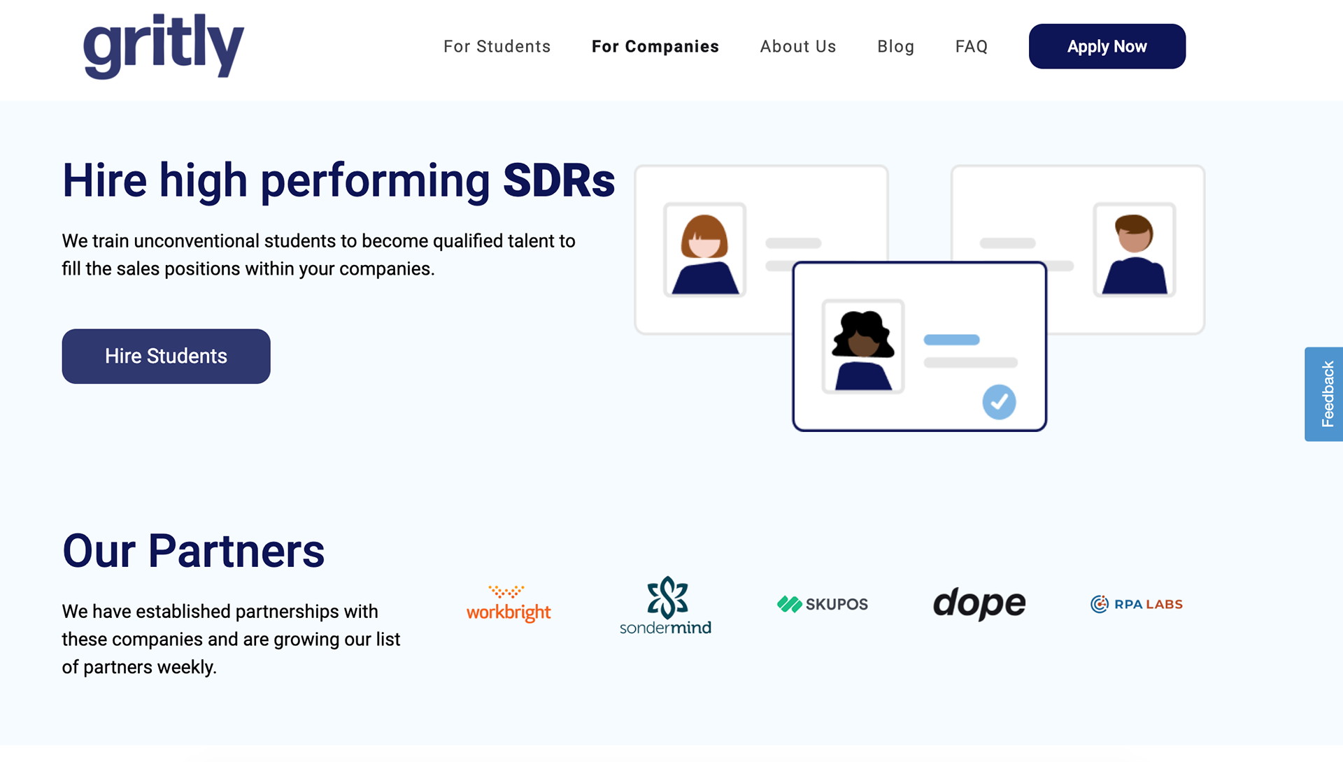
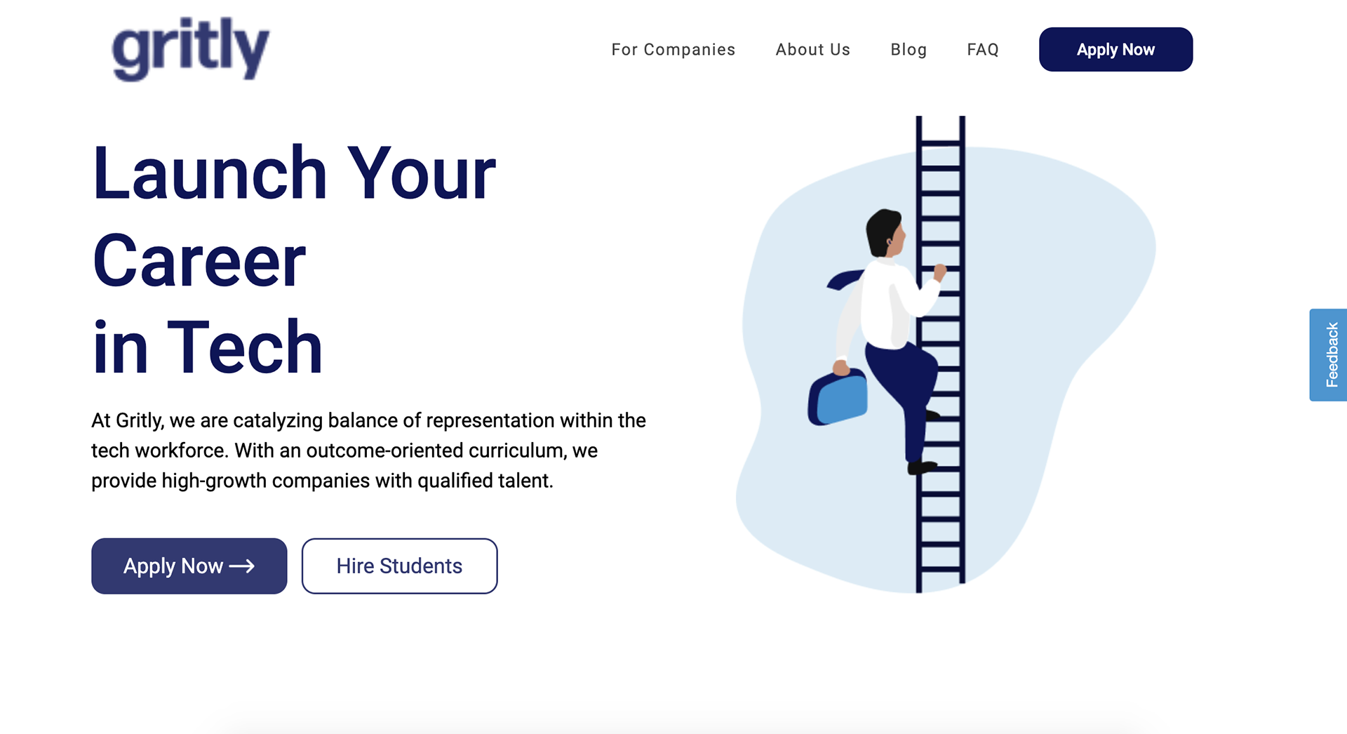
Gritly is an EdTech platform that helps students build real-world skills through project-based learning. The existing user portal was functional but uninspiring, leading to drop-off during onboarding and low engagement with learning materials.
I redesigned the entire user-facing experience, from onboarding through course completion, resulting in significant user growth and improved retention metrics.
The Big Numbers
The redesigned platform drove measurable improvements in user acquisition and engagement.
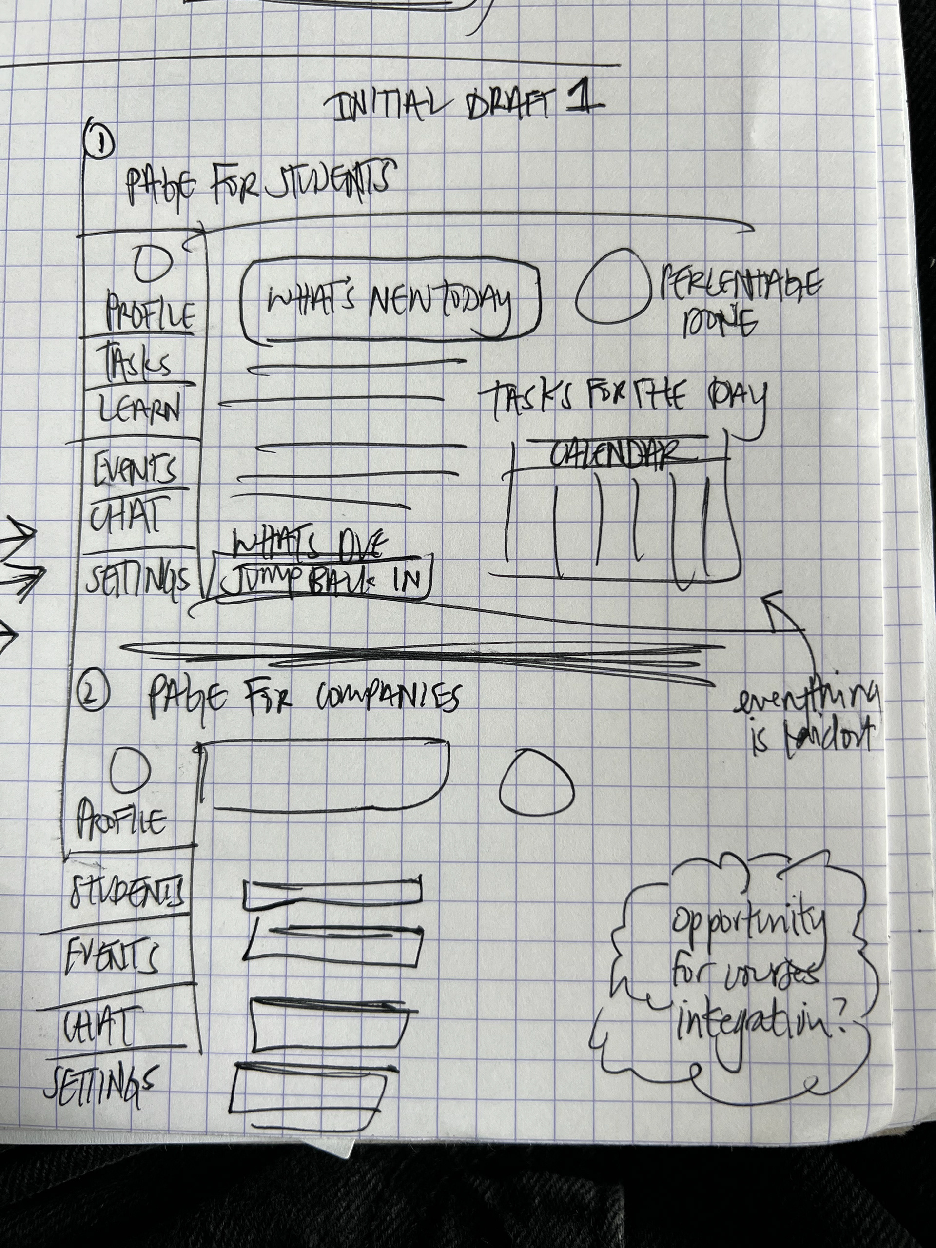
What I Worked On
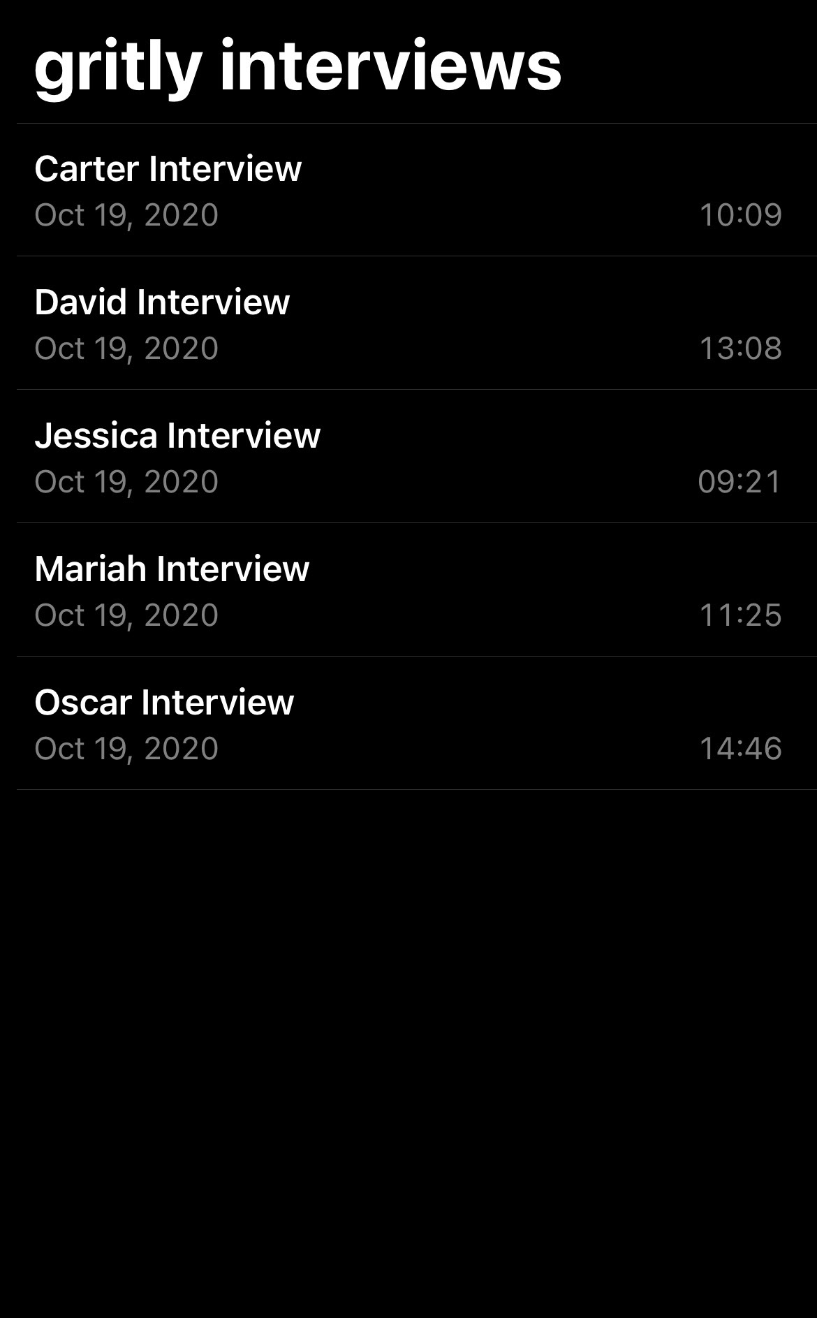
Redesigned the student portal, onboarding flow, and course experience from the ground up.
- User research and competitive analysis
- Onboarding flow redesign to reduce drop-off
- Student dashboard and progress tracking
- Course content presentation and interaction design
- Mobile-responsive design across all flows
The Challenge
The existing platform had strong educational content but a dated interface that failed to engage a Gen Z audience. Students were signing up but not completing onboarding, and course engagement was below targets.
The design needed to feel modern and engaging while supporting complex learning workflows and progress tracking.
The Solution
I created a modern, gamified experience that made learning feel rewarding. Progress indicators, achievement badges, and clear visual hierarchy guided students through content while keeping them motivated.
The onboarding was simplified from 8 steps to 3, and the dashboard was redesigned to surface the most relevant next action for each student.
What I'm Proud Of
- Drove 50%+ user growth through design improvements alone
- Reduced onboarding steps from 8 to 3 while improving completion rates
- Created a design language that resonated with a Gen Z audience
- Built a scalable component system that the engineering team loved working with
Let's Create Something Lovely
Together!
Have a project in mind? Looking for a designer? I'd love to hear about it. Whether it's a quick consultation or a full redesign, delightful outcomes start with a conversation.
Start a Conversation