FORCE
Enterprise automation platform powering Charter's device updates across the country


What the Heck Is FORCE
Today, Charter does not have automated monitoring and orchestration, updates to devices added to the network and lifecycle management at scale will be operationally challenging, if feasible. Currently, teams require manual work during installs and updates, have limited network visibility, and are prone to operator error.
Operations teams need to deploy 100,000s of RPDs with no room for error and immediately be able to identify points of error and iteration.
Charter began a $1.5 million project, FORCE to solve these solutions. I spearheaded the UX strategy for the entire platform as the sole Sr. Product Designer - UI/UX. In 8 months, I led UX for FORCE, the enterprise automation platform powering Charter's device updates across the country. I delivered a system that scaled operational capacity by 400%, achieved 98-100% accuracy, unified five teams, and replaced multiple legacy tools across thousands of devices.
The Big Numbers
FORCE became the backbone of Charter's nationwide RPD automation - replacing messy tools, conflicting data sources, and cumbersome workflows with a centralized, accurate, and scalable UI.
What I Worked On
My Role
Design at Scale
as the sole Sr. Product Designer on a $1.5M enterprise platform.
Designing was one of my many hats! My role extended to educating, advocating, and defending best UX practices into a product development process that had never had a designer before. I disrupted a fragmented engineering culture and brought together back end, front end, and API integration.
Owned UX strategy for the entire platform. Built information architecture, defined workflows end-to-end, and established design principles that guided 5 engineering teams. Created Figma organization, documentation standards, and the UX intake process. Regularly presenting to execs, VPs, and the team, I became the go to leader and approver for design decisions.
The Brief
A Problem No One Had Solved Yet
The Challenge
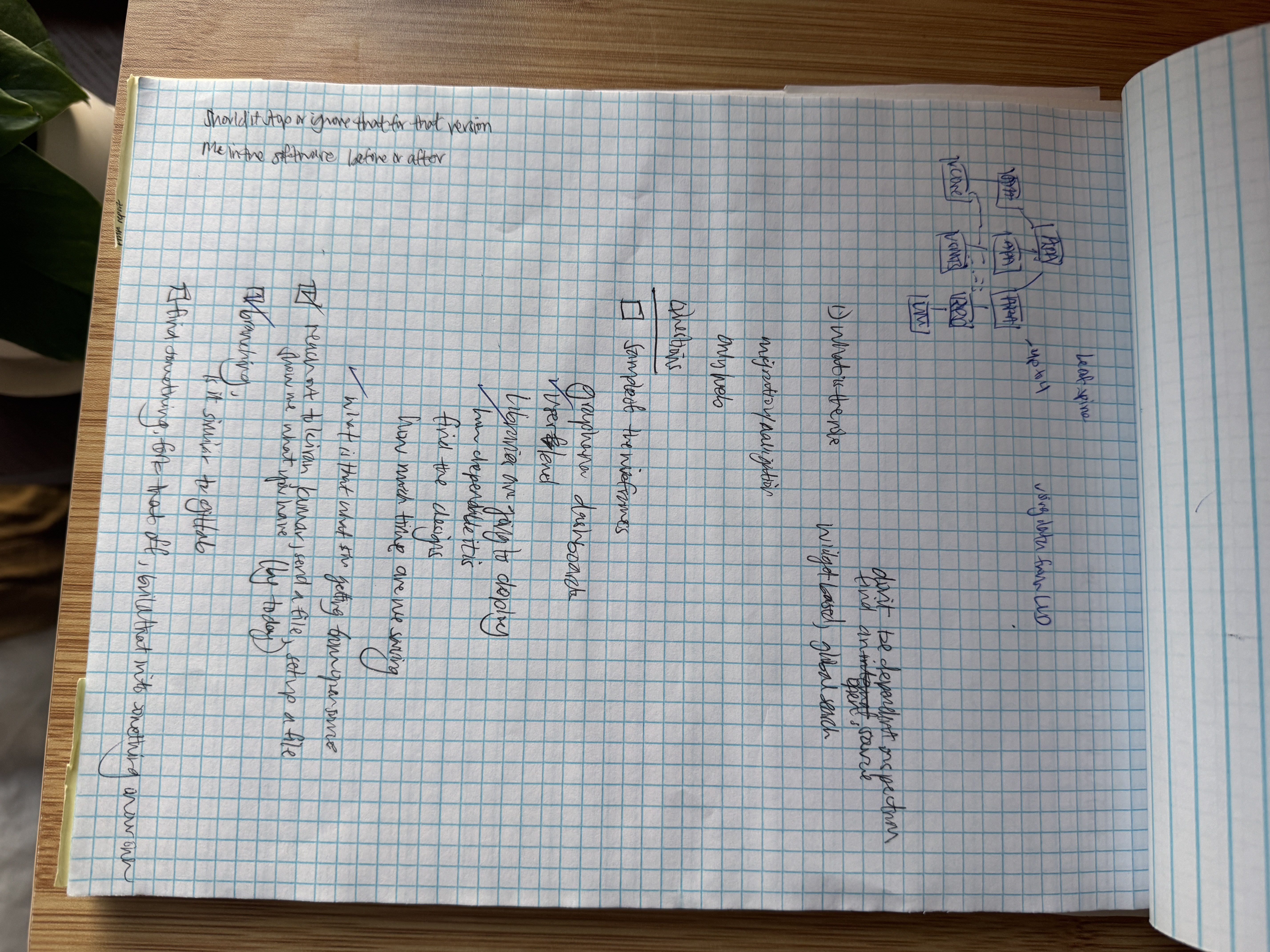
When I joined FORCE, the problem wasn't just the UI, it was the entire ecosystem surrounding it. Charter had merged three legacy companies (Time Warner, BrightHouse, and Charter), each running different tools, different vendors, and different logic. The engineering teams had conflicting requirements. The offshore developers were delivering broken code. And executive bonuses were tied to FORCE hitting automation targets it couldn't reliably hit.
The Solution
FORCE
A full source of truth automation platform built to update thousands of devices across legacy networks.
FORCE consolidates five legacy tools into one unified platform. The system automates device updates and orchestration at scale, giving operations teams a single place to monitor, schedule, and manage deployments across Charter's networks.
$1.5M
engineering investment
5
legacy companies consolidated under one UI
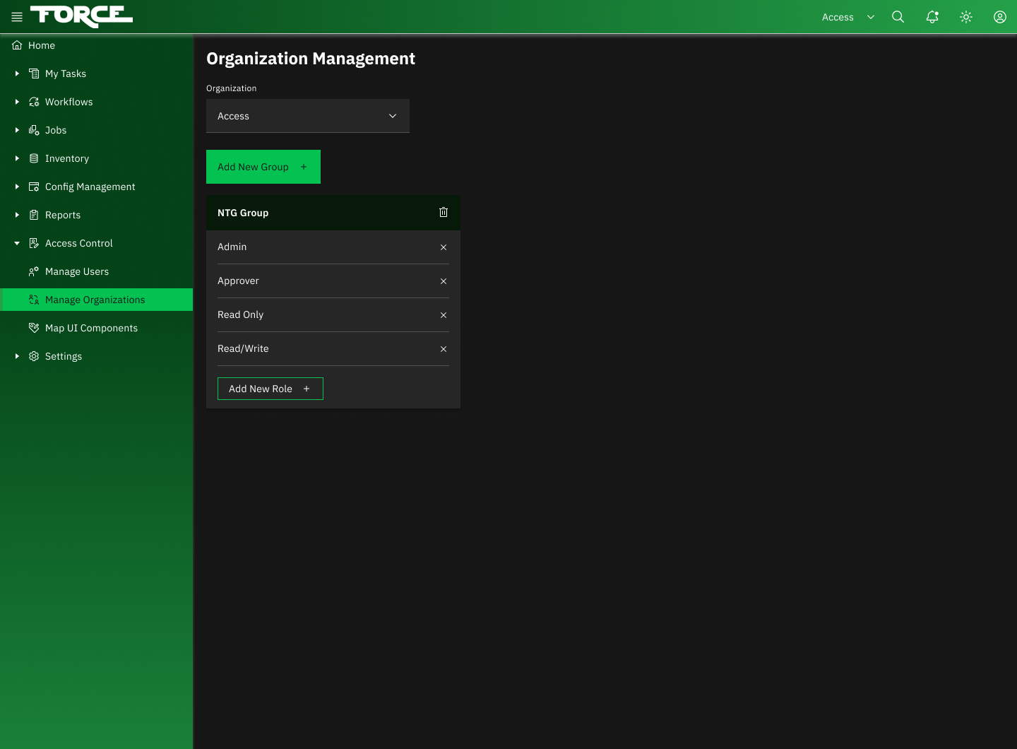
6
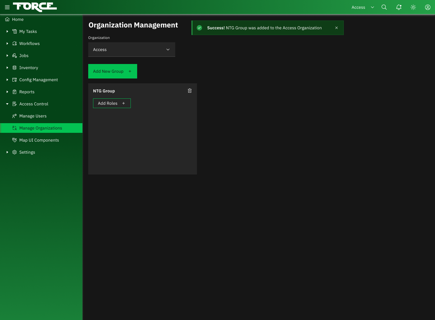
user types with RBAC roles and workflows
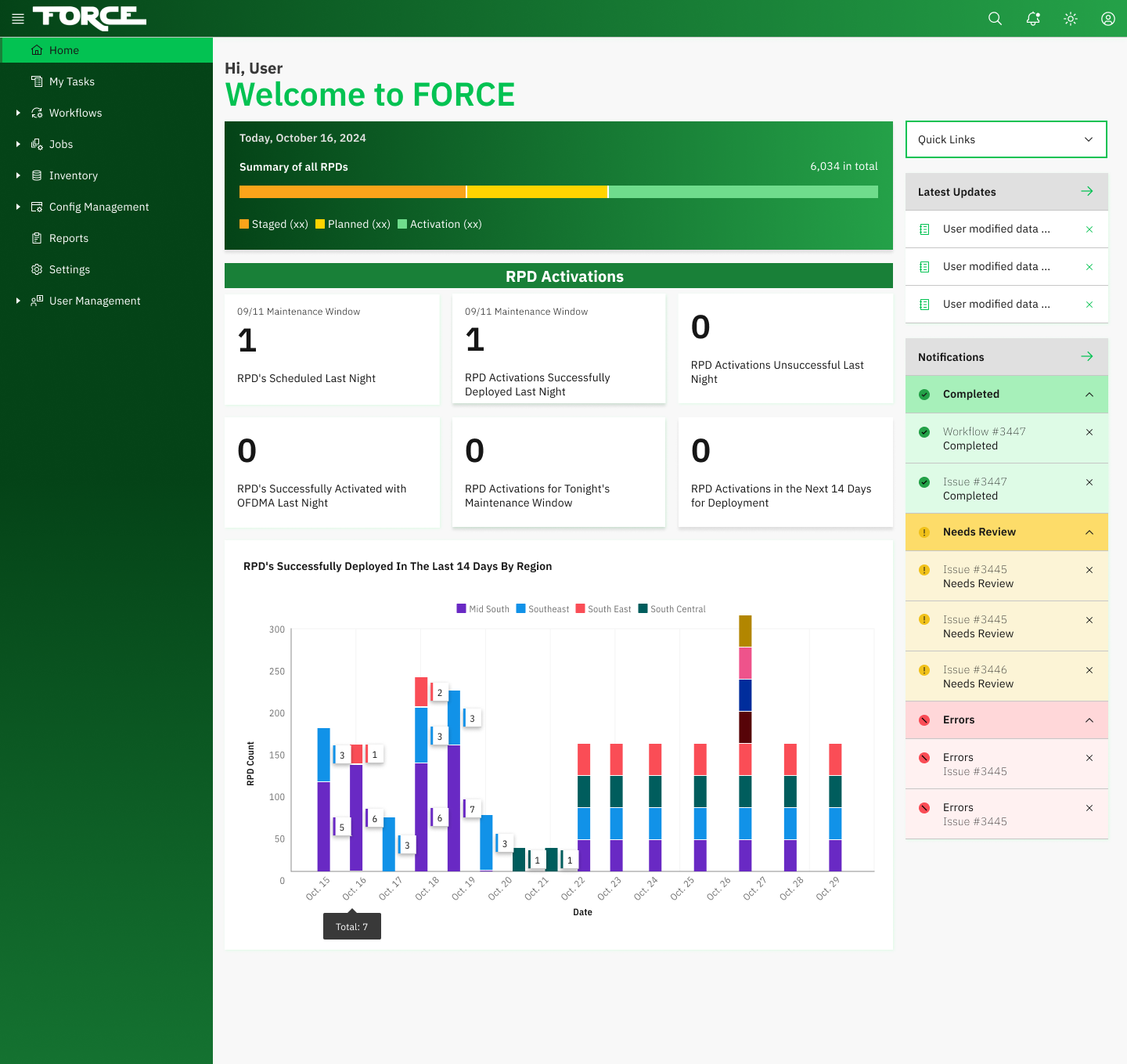
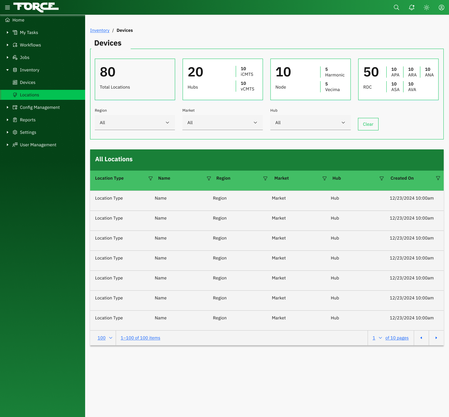
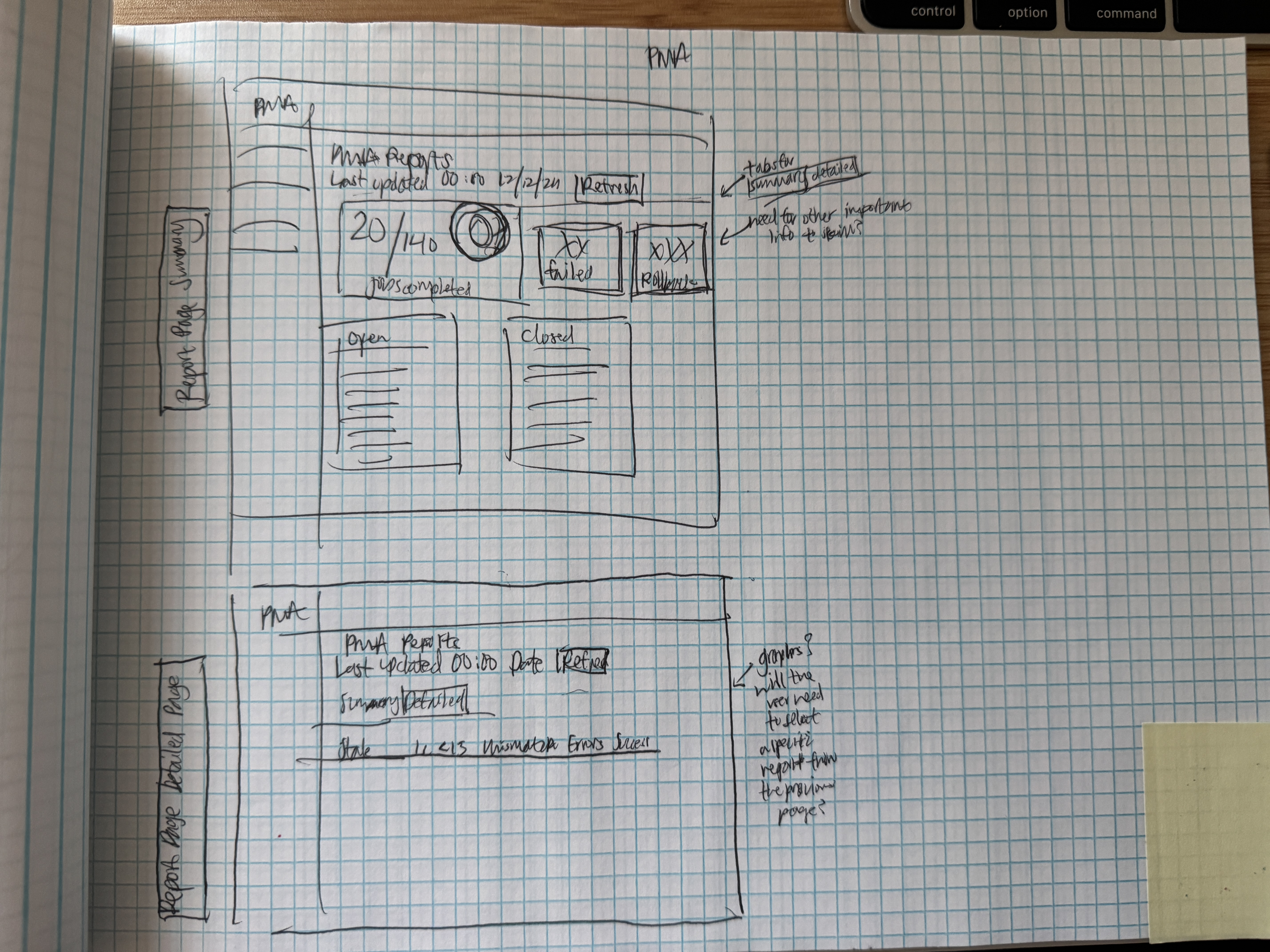
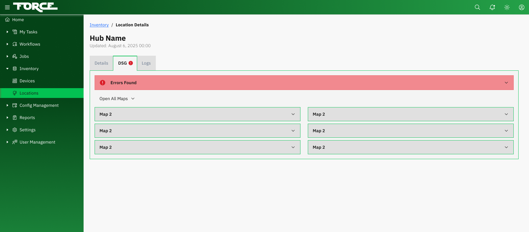
Real-Time Dashboard. A centralized command center giving operations teams instant visibility into device status, deployment progress, and system health across all regions.

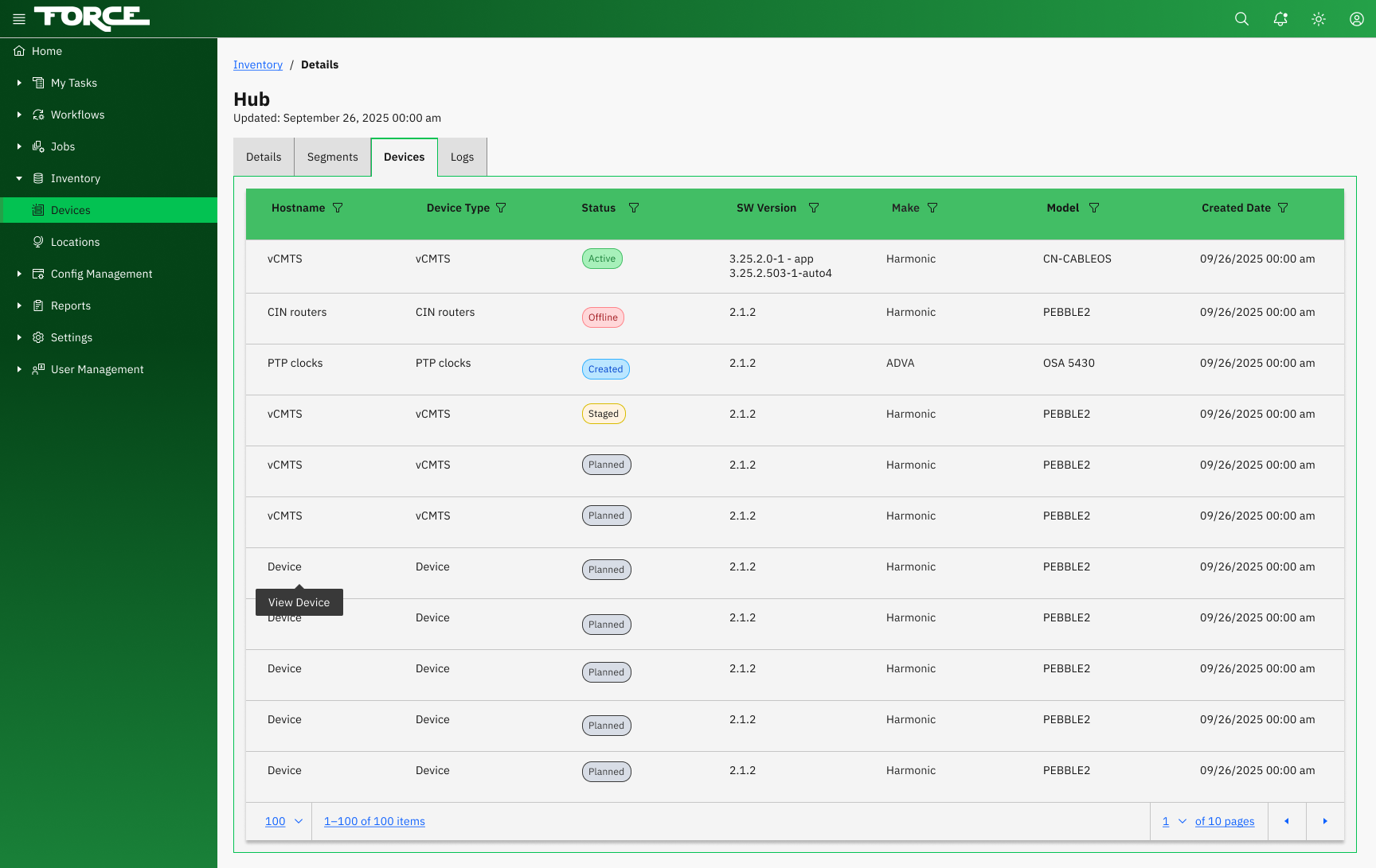
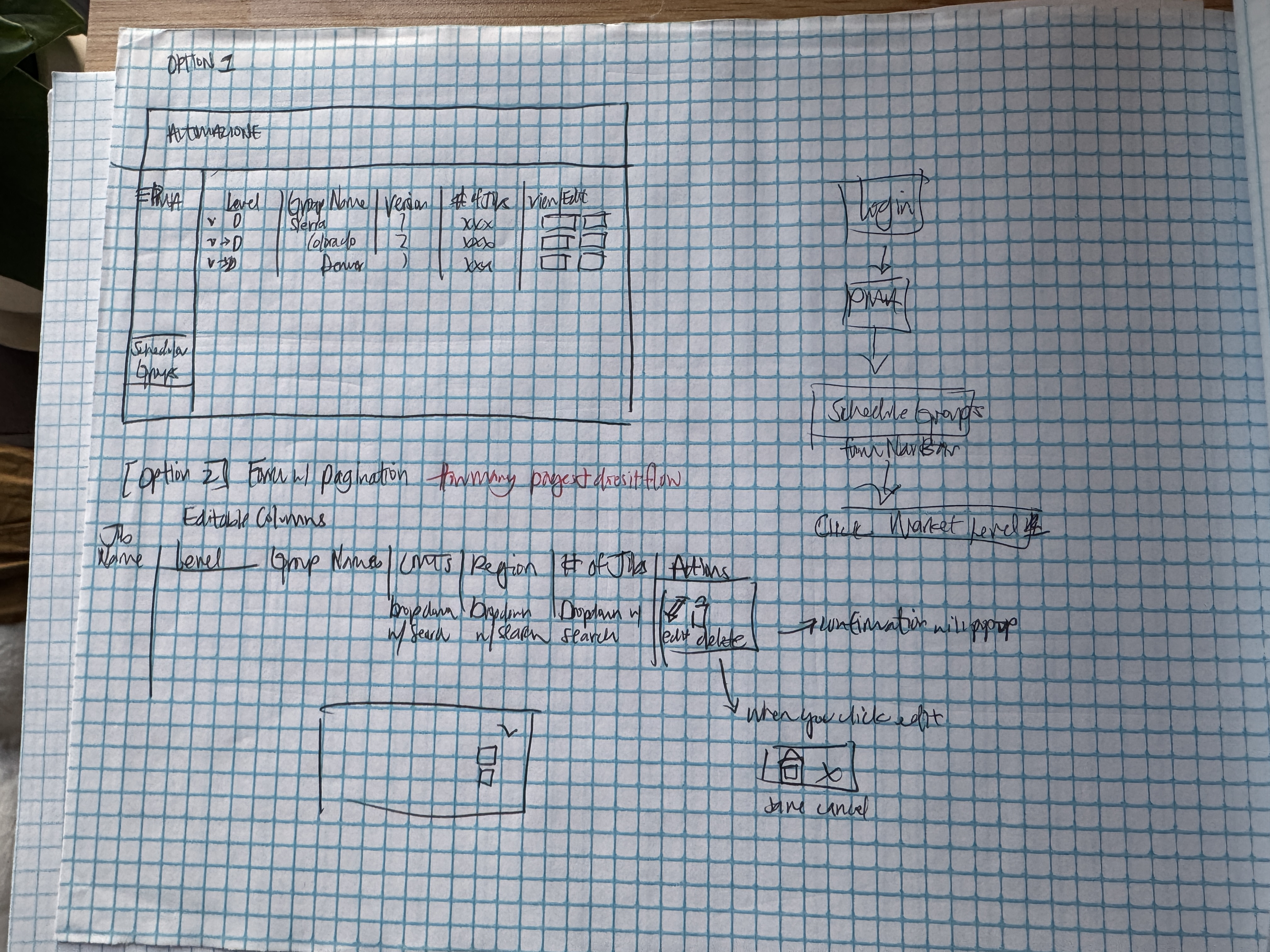
Inventory Management. Track and manage hundreds of thousands of RPD devices with advanced filtering, bulk actions, and detailed device-level views.
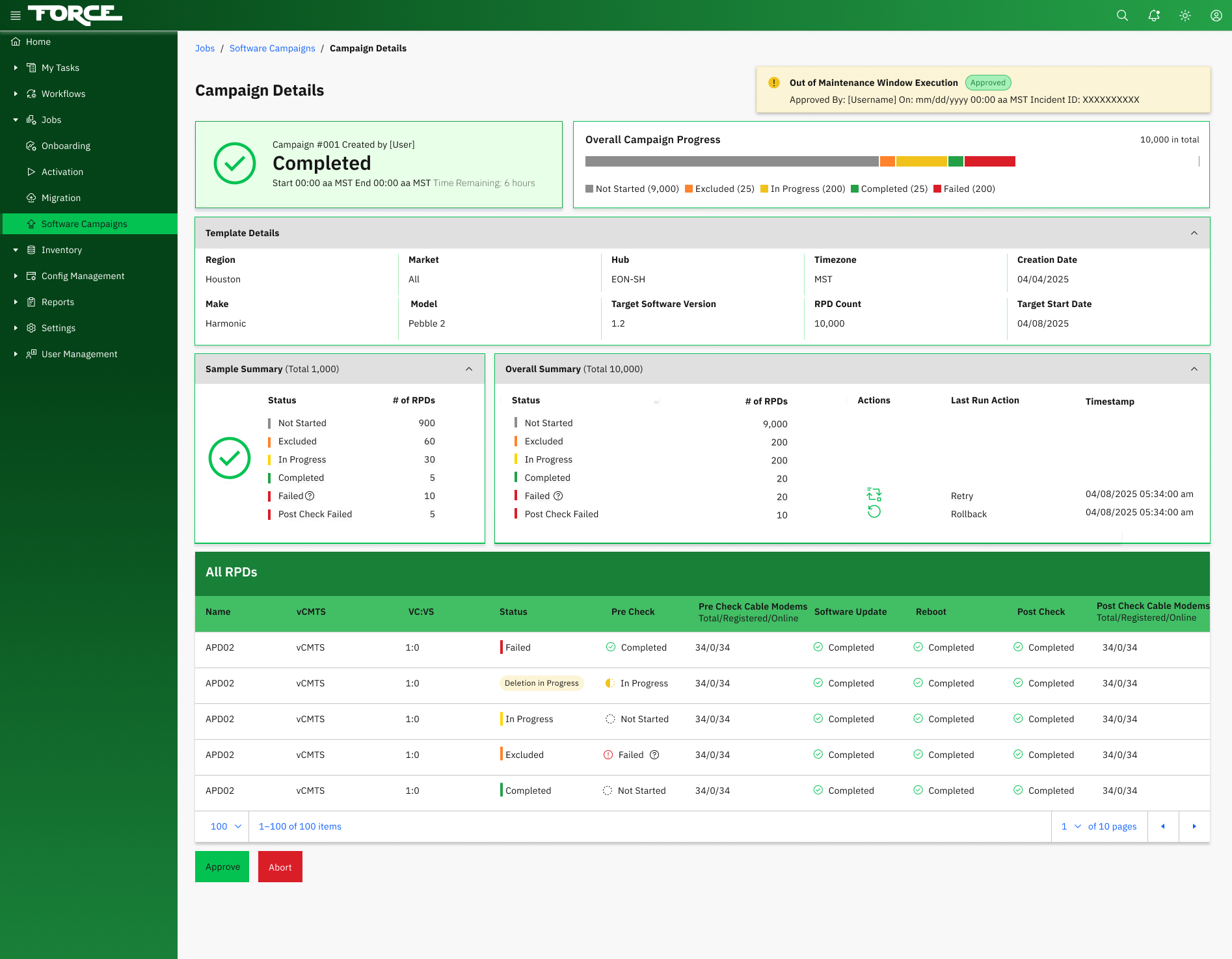
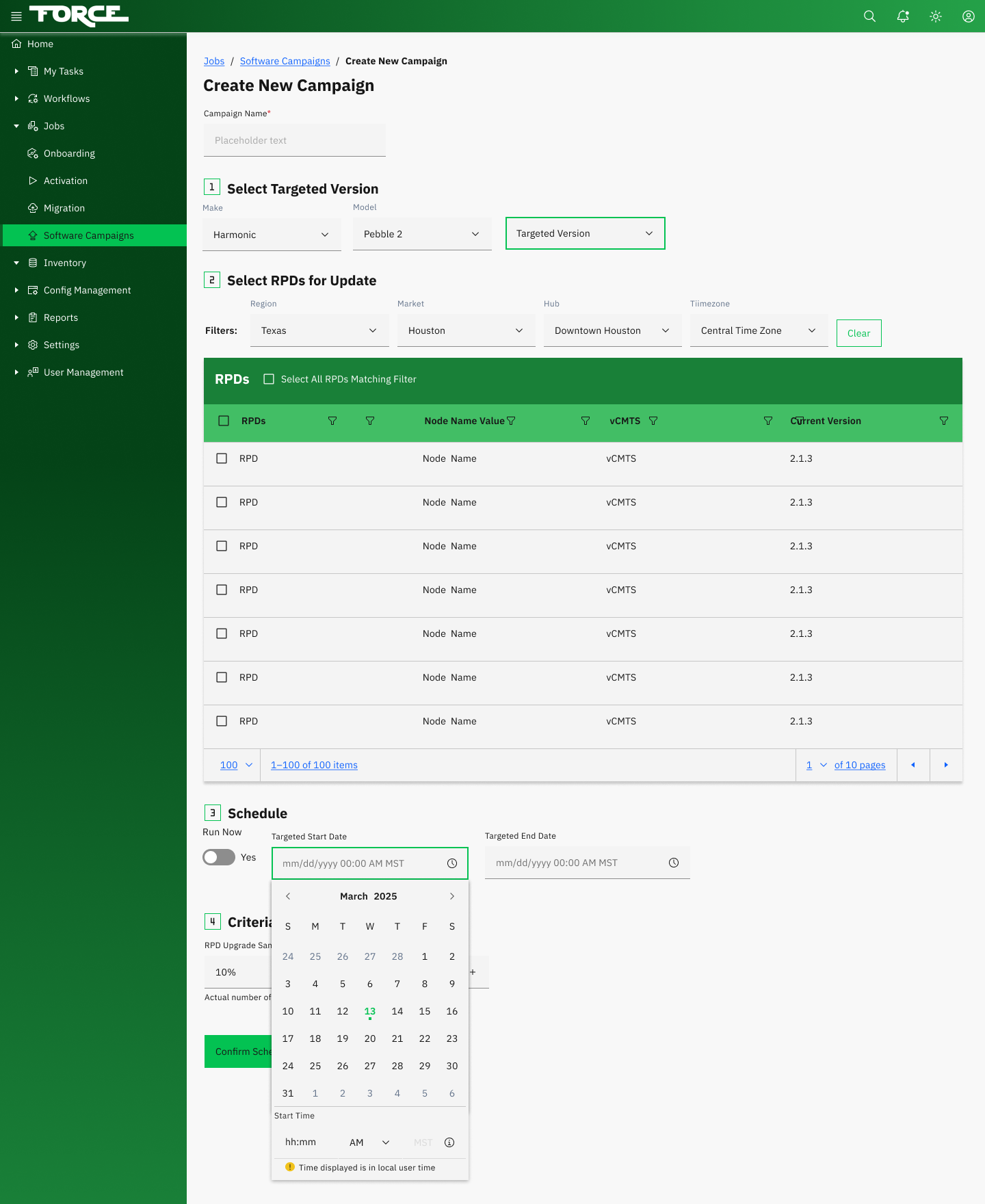
Automated Upgrades. Schedule and orchestrate device firmware updates at scale with built-in validation, rollback capabilities, and real-time progress tracking.
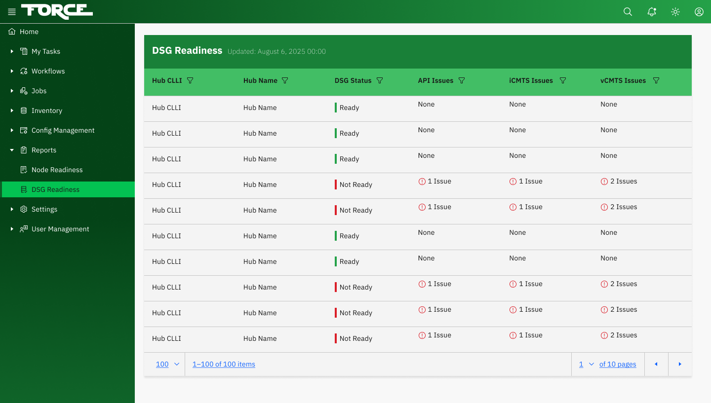
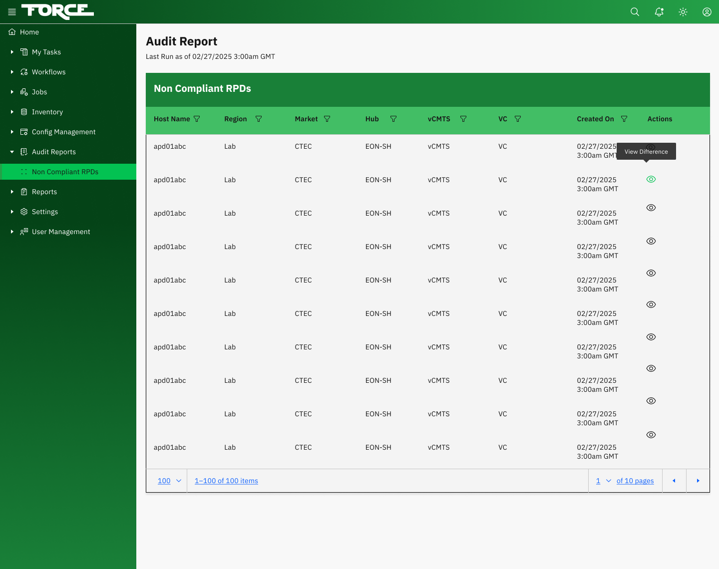
Reporting & Analytics. Generate DSG readiness reports, audit trails, and deployment analytics to drive data-informed decisions across teams.
My role was to design the entire experience from the ground up: defining the UX strategy, aligning engineering teams, and establishing a UX discipline that didn't exist before this project.
Questions I Get Asked
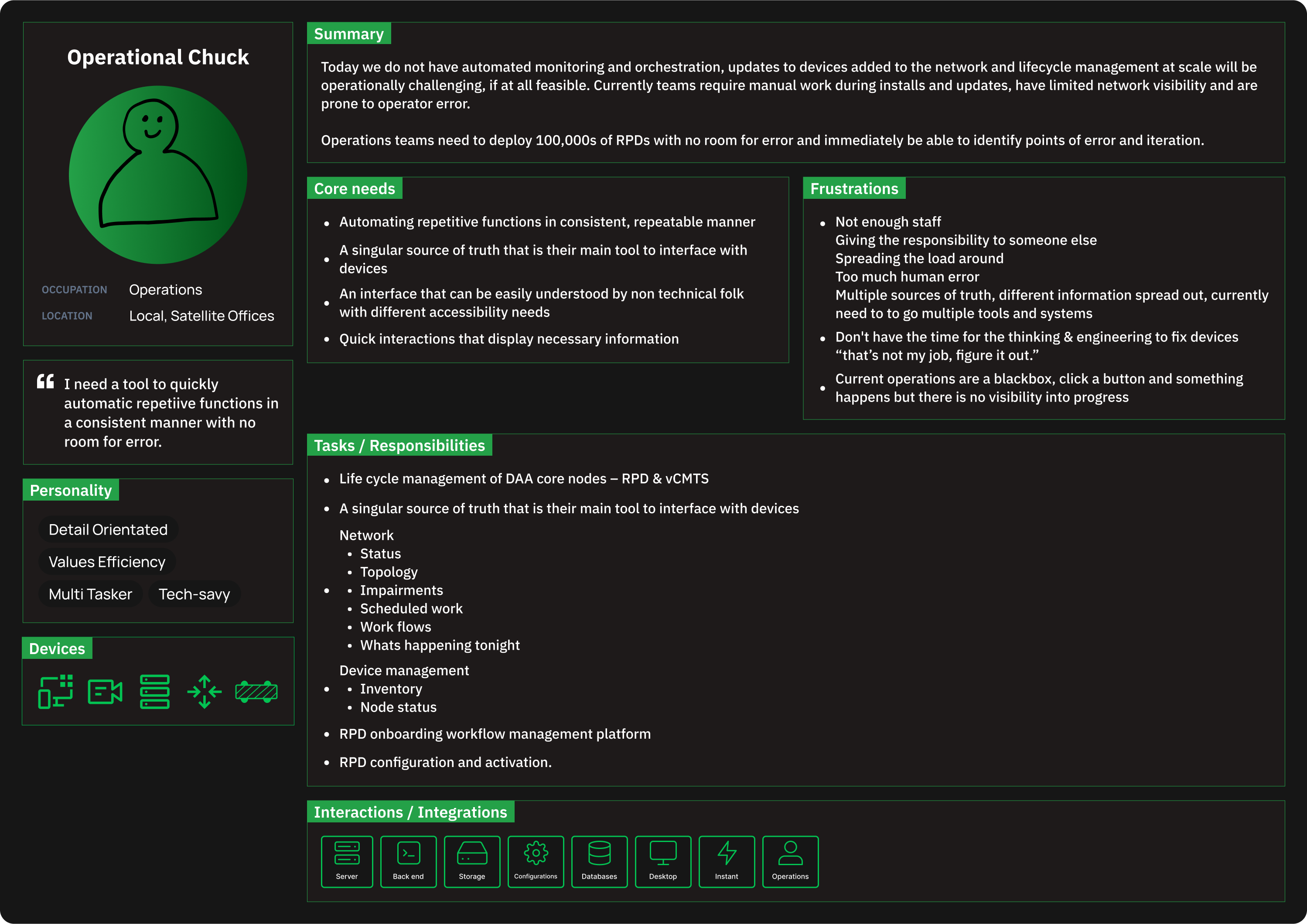
A Diverse Group of Stakeholders
Paul
Field Technician
Installs and maintains RPD devices in the field. Needs clear, step-by-step workflows and real-time device status. Works in harsh conditions with limited connectivity.
Mel
Sales Engineer
Demonstrates FORCE capabilities to internal stakeholders and partners. Needs polished dashboards and clear data visualizations that tell the platform's story at a glance.
Juan
Software Engineer
Builds and maintains the platform. Needs clear design specifications, documented component APIs, and predictable patterns that translate cleanly into code.
Shelly
Product Manager
Owns the product roadmap and prioritization. Needs high-level dashboards, reporting tools, and the ability to track deployment progress across regions.
Alex
Network Operations
Monitors network health and manages device configurations at scale. Needs dense data tables, powerful filtering, and bulk action capabilities.
Jordan
QA Engineer
Validates platform functionality and device update accuracy. Needs detailed audit logs, comparison views, and the ability to trace issues back to their source.
Persona Deep Dive
Why Desktop Came First
We only prioritized desktop because that's what the users were using. This meant embracing complex table patterns, multi-panel layouts, and keyboard shortcuts - design patterns that are often avoided in consumer products but are essential for power users who live in a tool eight hours a day. The data showed the overwhelming majority of primary usage happened at workstations, not tablets or mobile. We made the strategic decision to design desktop-first and optimize for information density.
Building Charter's First Design System
Charter had no design system before FORCE. I built the system in parallel with the product - a deliberate choice that meant components were battle-tested in real context before being added to the library. The system established a shared visual language that enabled consistent delivery across five distributed engineering squads.
User Flows
Mapping Every Path Through the System
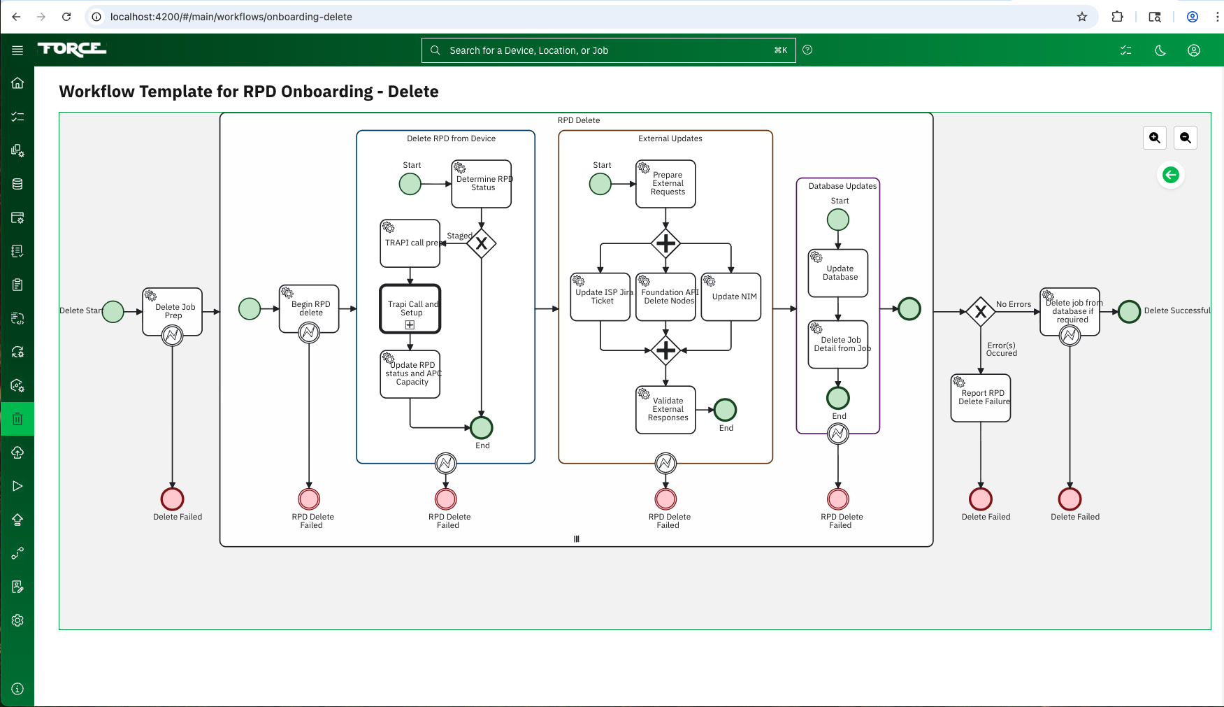
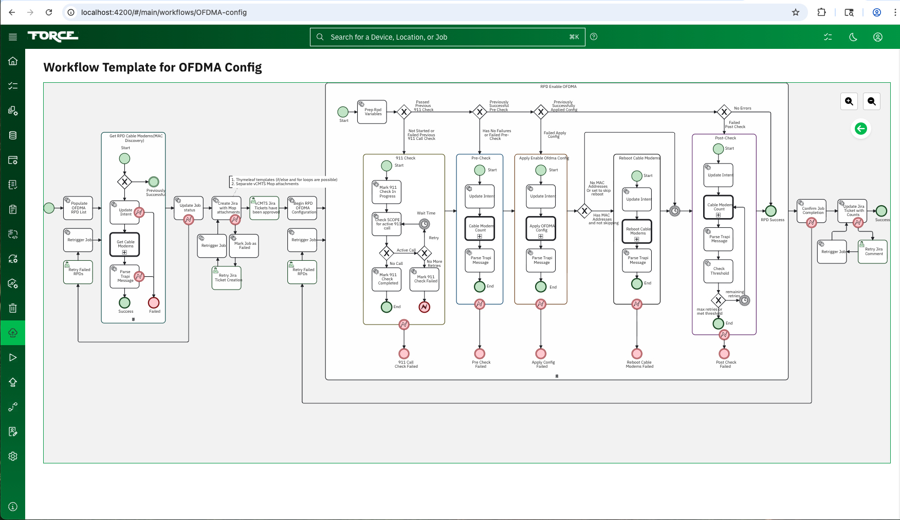
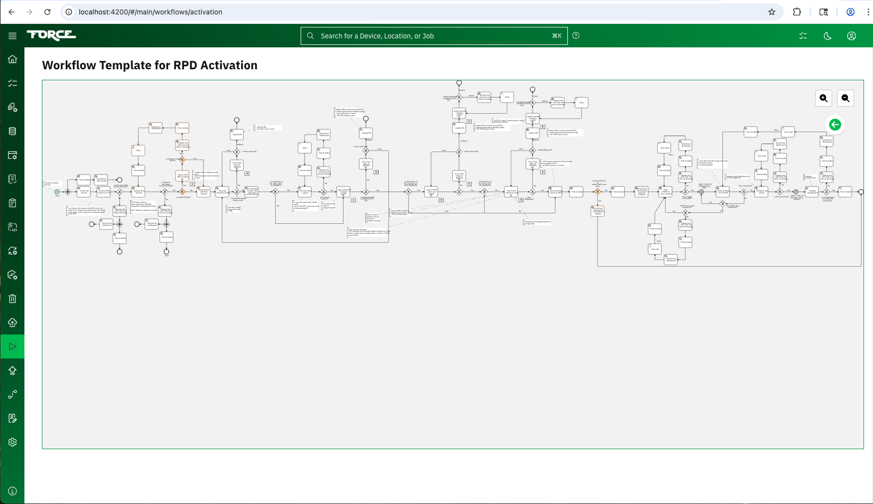
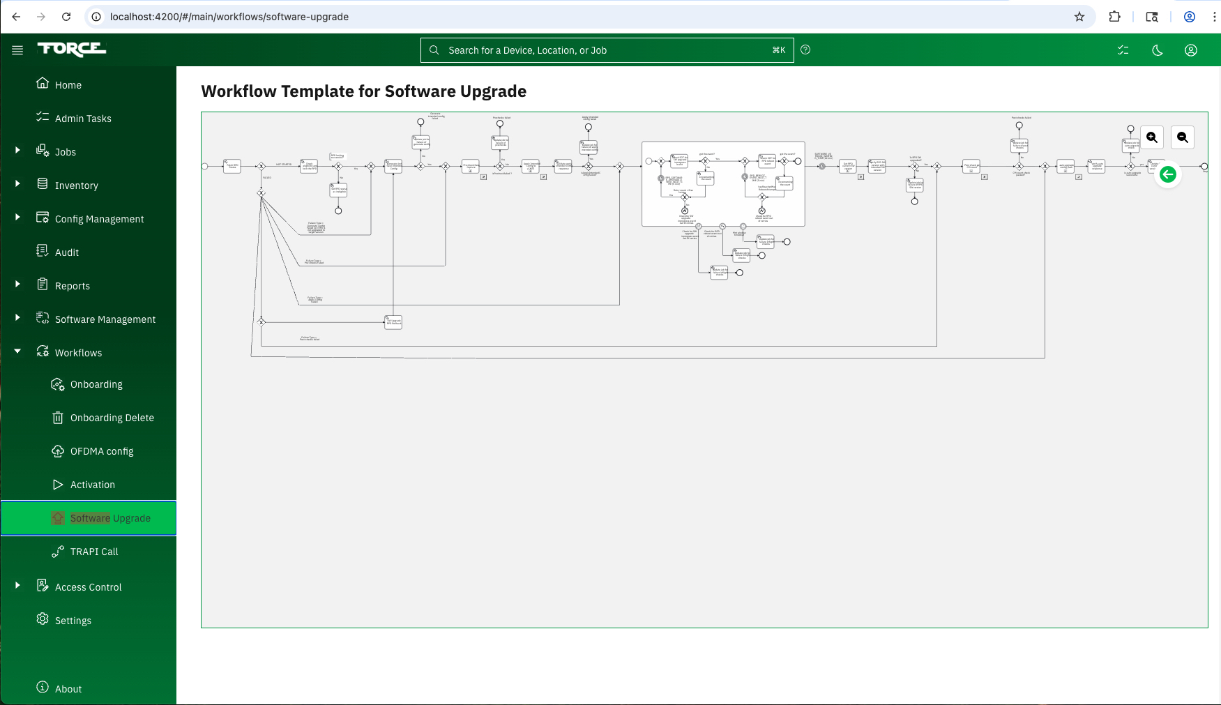
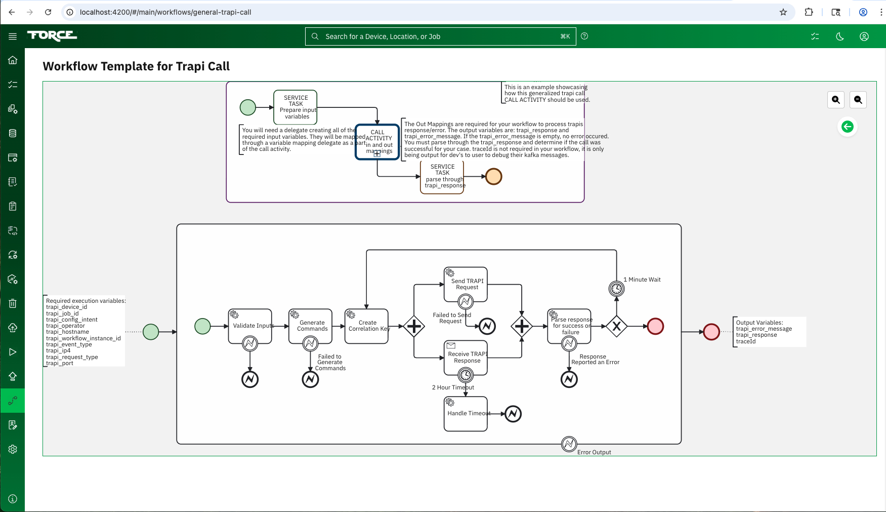
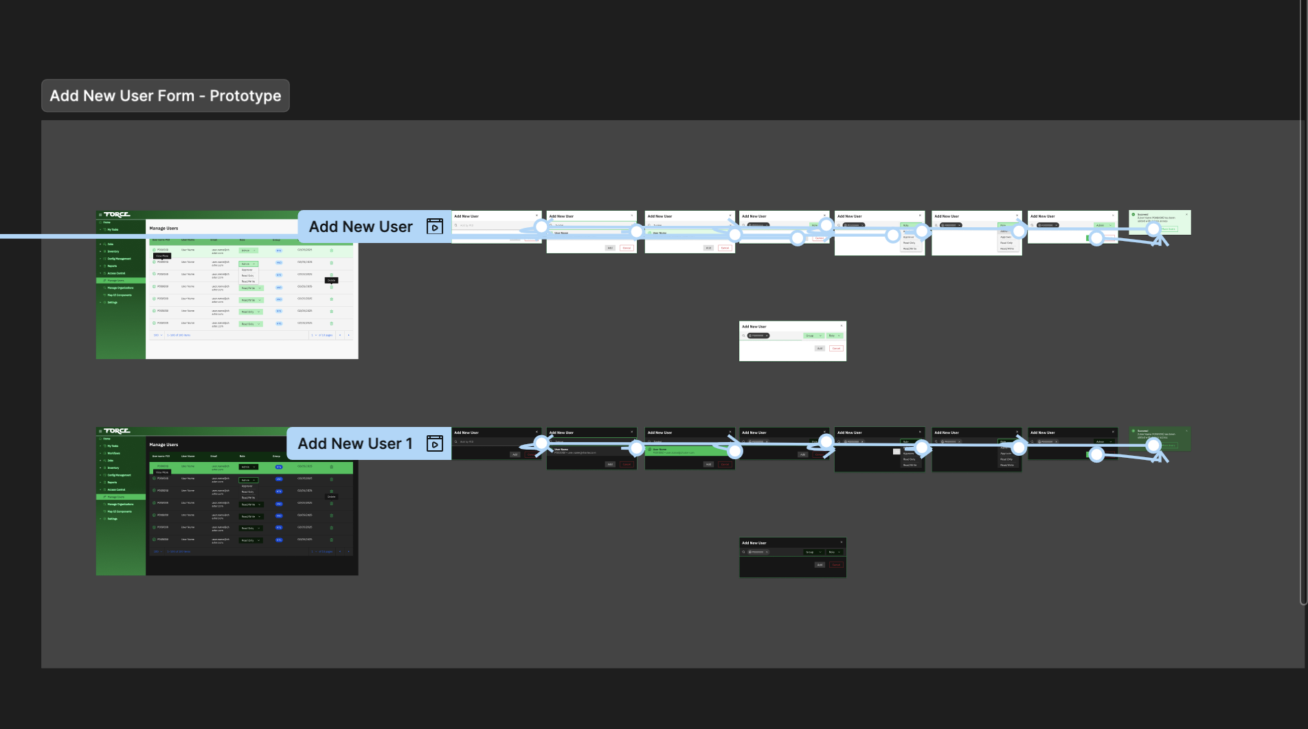
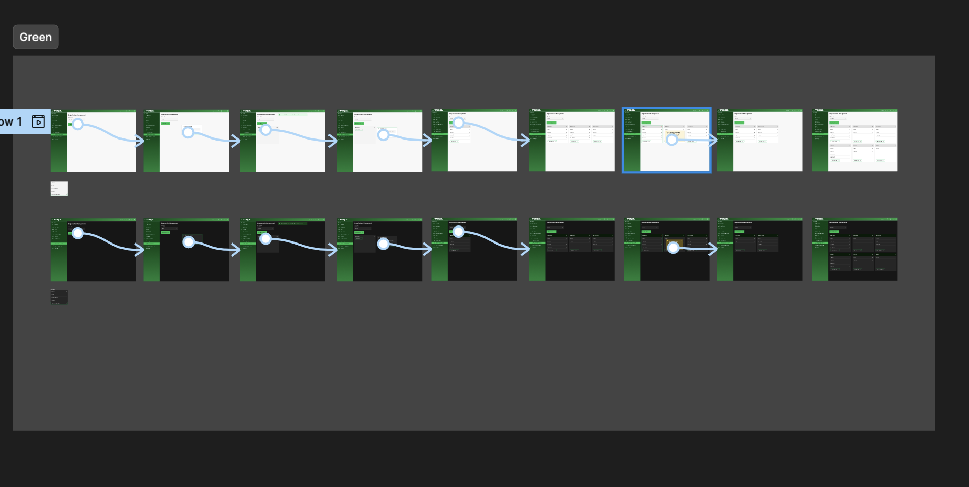
Before any screen was designed, I worked with the engineering team to map every critical workflow end-to-end using Camunda. Six flows covering the core automation lifecycle and other flows as well, from device onboarding to scheduled updates to failure recovery. These became the source of truth for every engineering team as they built. We also integrated these into the FORCE UI so the user no longer had a black box effect while they were working.
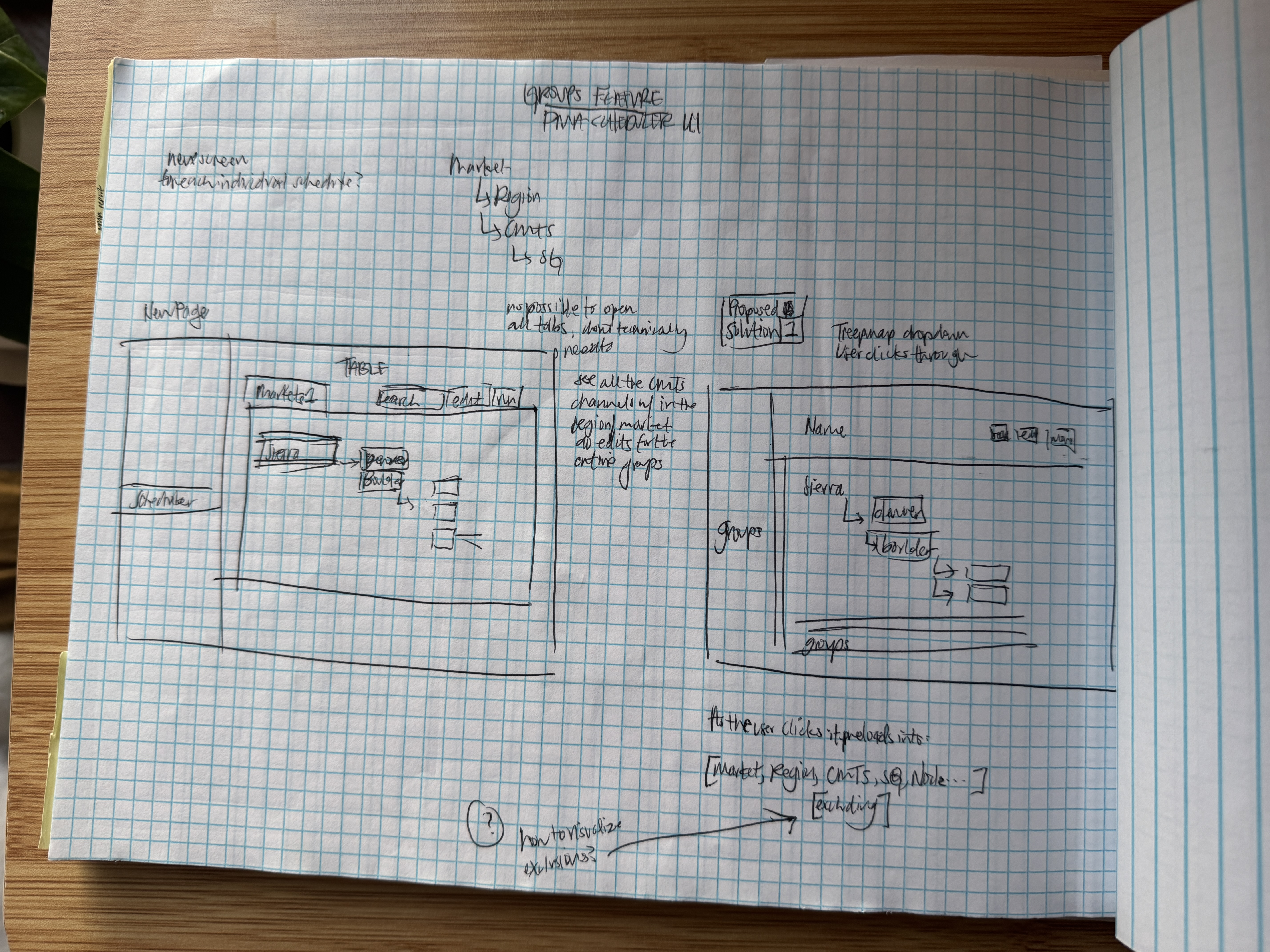
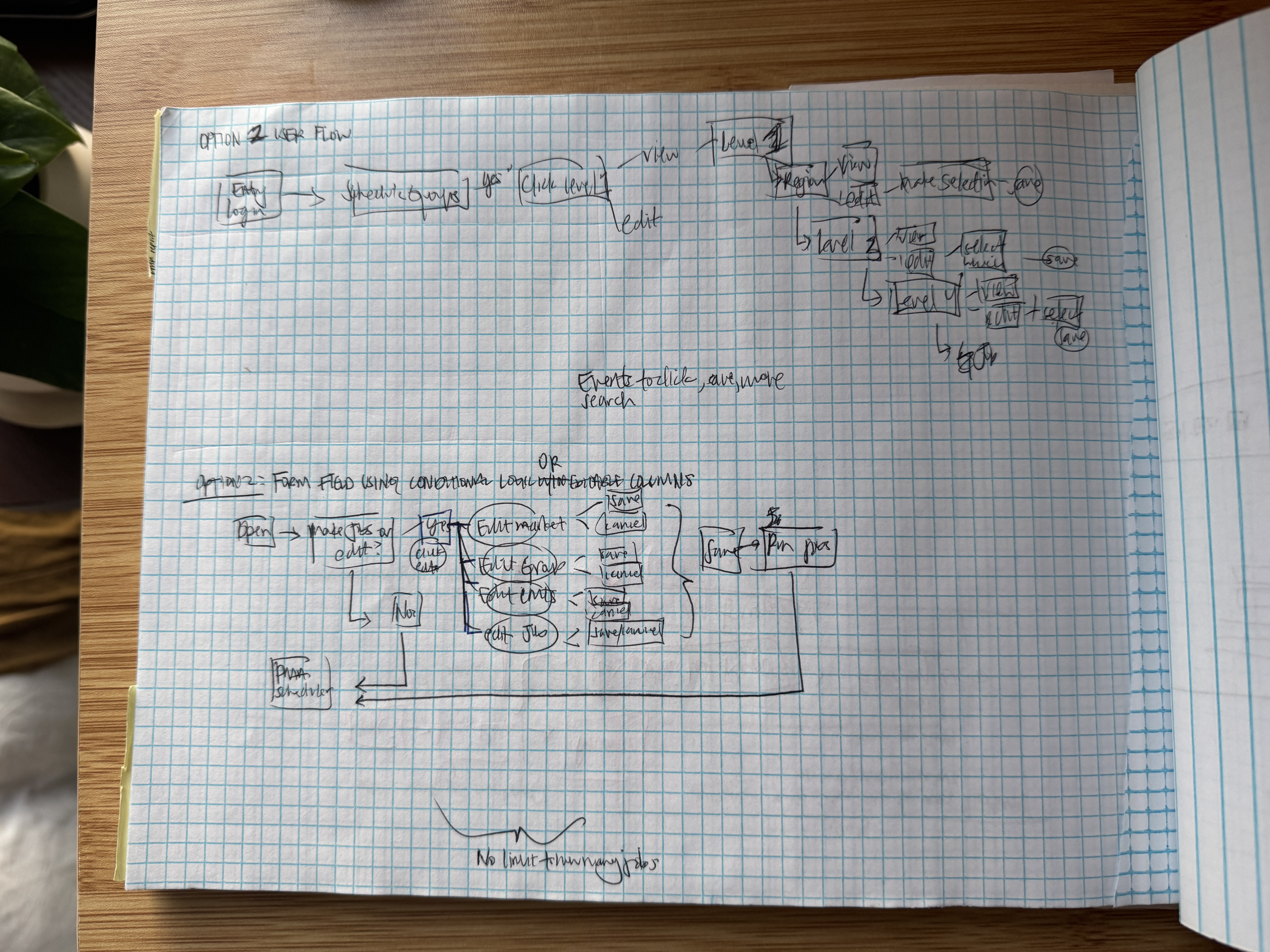
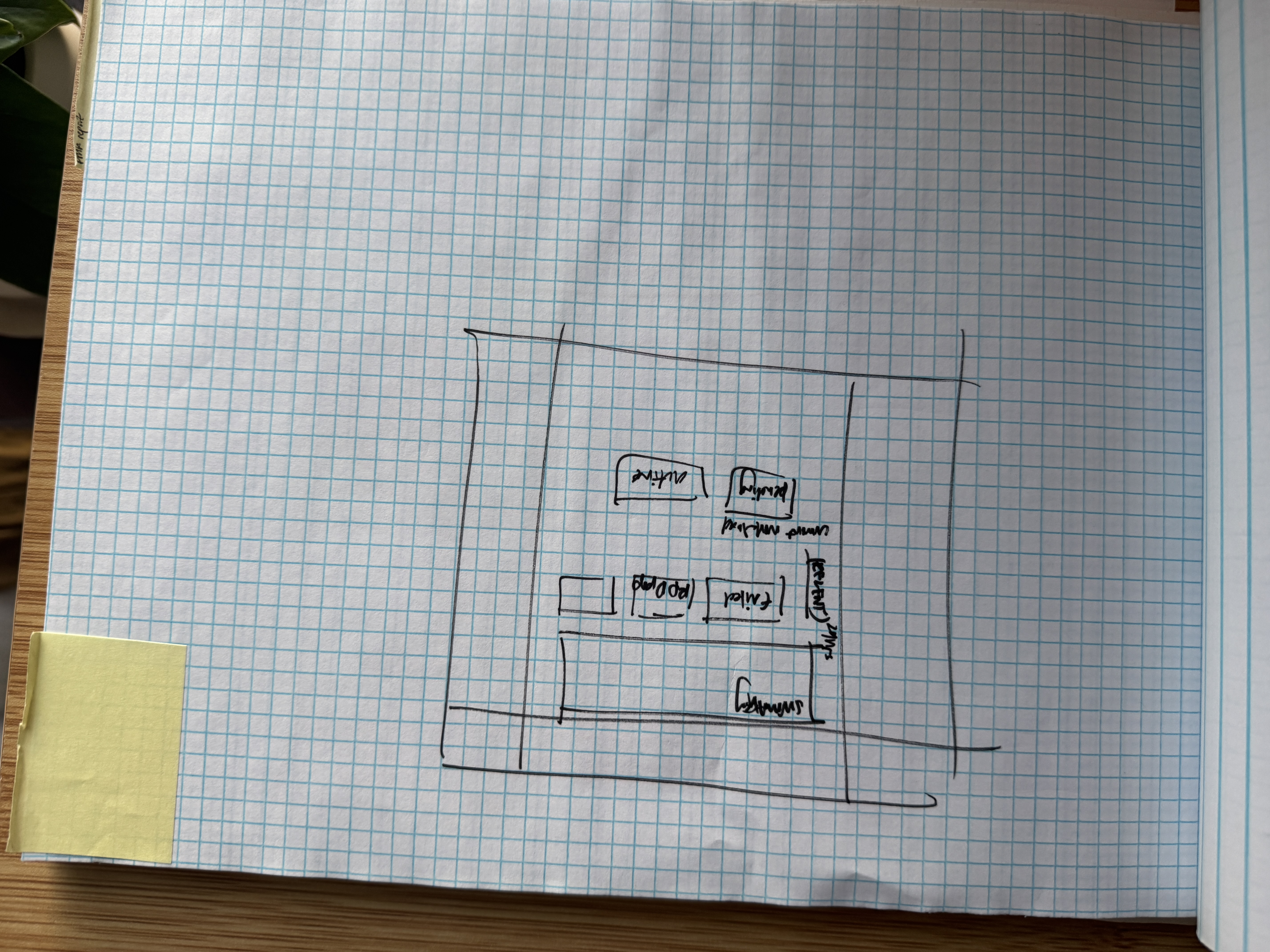
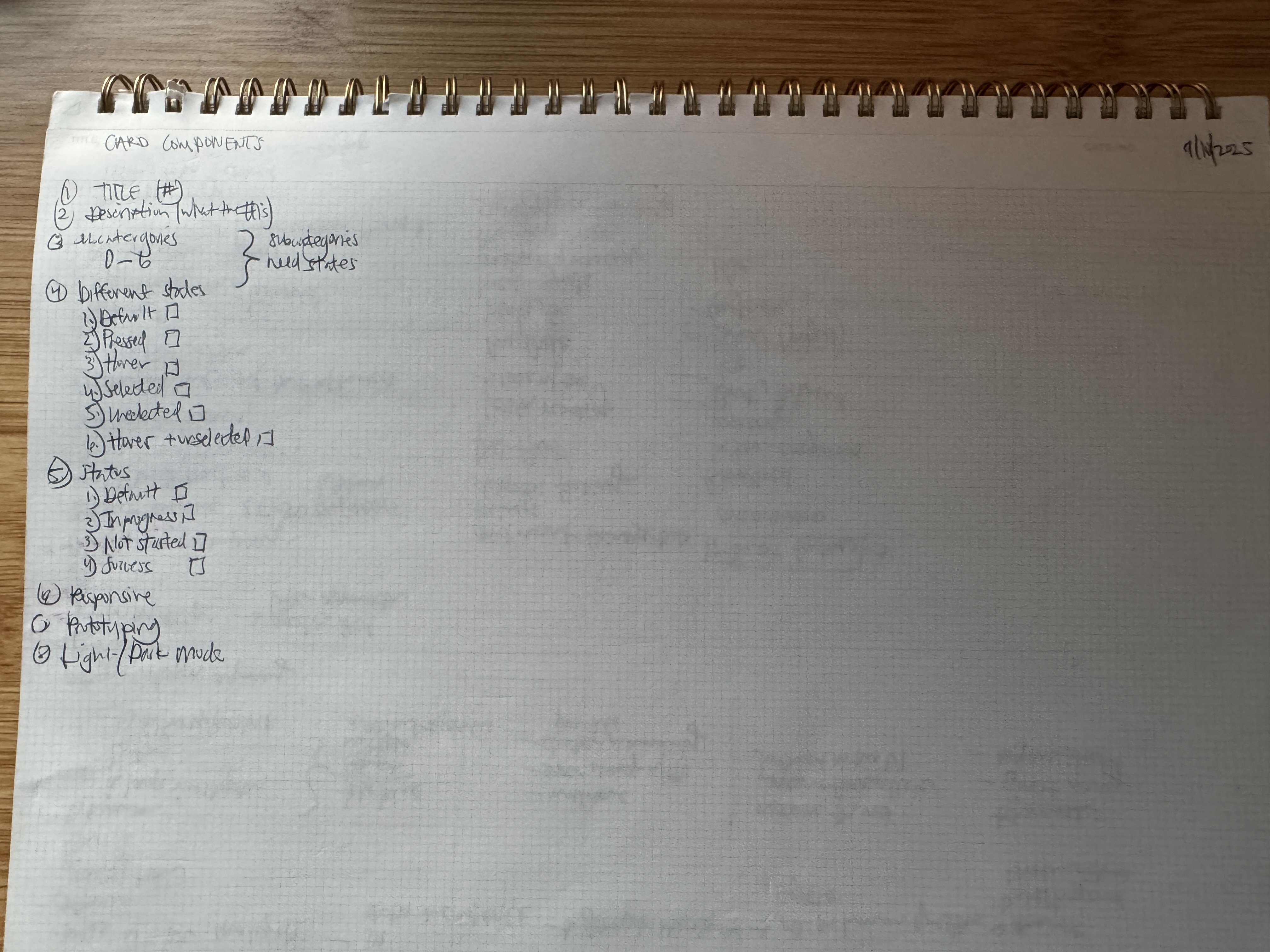
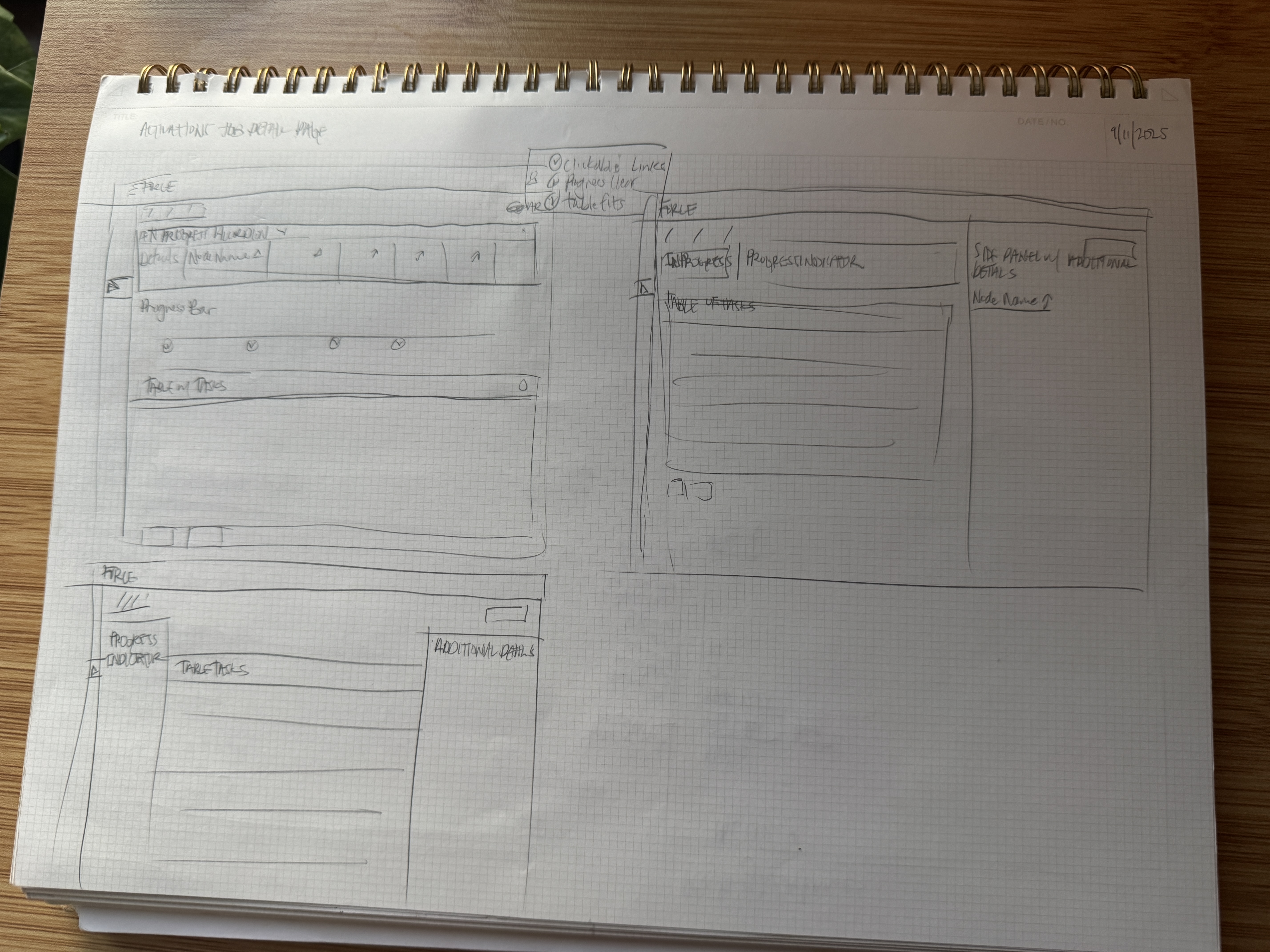
Lo-Fi Wireframes
Early Drafts
Every screen started here. I mapped 100+ user workflows before touching hi-fi, validating with engineers, PMs, and real operators before a single pixel was finalized. The lo-fi process saved weeks of rework and allowed the engineering team to feel more part of the process.
Production-Ready Designs
“Production-ready” meant more than polished visuals. Every screen shipped with annotated specifications covering interaction states, loading behaviors, error conditions, empty states, and responsive breakpoints. I held weekly design-to-dev pairing sessions where engineers could ask questions in real time, reducing the back-and-forth that kills momentum on large projects.

Figma Prototyping Connections
Design QA
Discrepancy Tracking
As the sole designer managing a $1.5M platform across 5 global teams, I maintained a comprehensive quality assurance system to track and resolve design-development discrepancies.
| Issue ID | Category | Priority | Summary | Status |
|---|---|---|---|---|
| FORCE-810 | UI Design | High | Dashboard card layout inconsistent across breakpoints | Resolved |
| FORCE-847 | Component | Critical | Date picker component missing disabled state styling | Resolved |
| FORCE-903 | User Flow | High | Onboarding wizard skips validation on step 3 | Resolved |
| FORCE-951 | Data Display | Medium | Table sort indicators not matching design spec | Resolved |
| FORCE-1022 | System | High | Toast notifications overlapping action bar on mobile | Resolved |
| FORCE-1087 | UI Design | Medium | Sidebar nav active state using wrong color token | Resolved |
| FORCE-1134 | Component | High | Modal close button hit area below 44px minimum | Resolved |
| FORCE-1198 | User Flow | Critical | Bulk action toolbar disappears after page refresh | Resolved |
| FORCE-1255 | Data Display | Medium | Chart legend truncating labels on smaller viewports | Resolved |
| FORCE-1366 | System | High | Loading skeleton not matching final layout dimensions | Resolved |
Micro-Animations & Interaction Design
Purposeful motion design for enterprise workflow tools, built to guide users through complex multi-step processes.
Workflow Step Transition
Multi-step process indicator
Guides users through sequential task completion
Status Change Animation
Dynamic status badge
Communicates state transitions with visual continuity
Data Table Row Loading
Staggered row reveal
Reduces perceived load time with progressive rendering
Form Validation
Inline input feedback
Provides immediate validation cues to prevent errors
Card Selection
Interactive card highlight
Clearly indicates active selection in card layouts
Notification Badge Counter
Animated notification count
Draws attention to new items without being intrusive
Tradeoffs
Speed vs. Perfection
Speed vs. Perfection
The motto was get it done. I chose to iterate fast with MVPs rather than waiting for perfection, because waiting wasn’t an option. Executive timelines were tied to automation targets. I validated early, adjusted based on real operator feedback, and shipped. It was difficult to not give the most user-amazing-fleshed out work but over time version iterations were developed into our project planning for quick dev hand offs.
Customization vs. Consistency
Every team wanted their own thing and lots of opinions of what should be done. I held the line on a shared component system instead, because 5 custom UIs would have meant 5 times the debt. We eventually were able to provide custom features and customization per user level and what their needs were, allowing greater satisfaction in our tool.
Innovation vs. Familiarity
The users were operations engineers who’d been doing the same workflows for years. Fully aware of this, I introduced modern patterns carefully, never disrupting familiarity more than the efficiency gain was worth.
Collaboration
Engineering Partnership
I worked directly with 30+ developers across the globe, including an offshore contracting team. The team consisted of VPs, PMs, Business Devs, Technical Leads, Front/Back end, and QAs. I built the handoff process, wrote the specs, ran the QA, and became the person everyone called when design met engineering reality. Strong dev partnerships weren't a nice-to-have, it's how I operate. I worked hard to build trust, understand and bring the right people into the room when questions were raised.
Reflection
What I'm Proud Of
There is a lot! This was a highly technical platform I was thrown into with no previous background in telecomms or wifi networks. There were tons of moving parts, voices, and opinions on this highly visible UI. To receive recognition that this was the most polished MVP to date, was a big deal to me.
When I first started I didn't feel qualified at all. I made many mistakes and learned immensely. When I left, I felt like I had become the right person for the job. I feel so much more confident in my skills across a variety of UX positions, if not the solo lead. No longer did engineers question why there was so much care and diligence into everything UX. I had earned their trust and I was capable of leading teams.
Mentoring and onboarding 2 junior and senior designers and creating a team with processes was so fun for me. We were delivering at a much quicker rate and the team felt the impact.
The processes I built are still in place. I feel like I walked so the team could run.
The thing I'm most proud of that can't be quantified is the impact I had on the team. I worked hard to bring the team closer together, create really great relationships, and be constantly reliable. My leave was sad but I'm so glad to have made life long relationships.
Let's Create Something Lovely
Together!
Have a project in mind? Looking for a designer? I'd love to hear about it. Whether it's a quick consultation or a full redesign, delightful outcomes start with a conversation.
Start a Conversation